Exploring Analogous Painting Colors
Did you know that color theory plays a crucial role in the world of visual arts? Understanding the relationship between colors and how they interact can unlock a whole new level of artistic expression. One fascinating aspect of color theory is the concept of analogous painting colors. These colors, derived from the color wheel, create harmonious compositions that captivate the viewer’s eye.
In this article, we will delve into the world of analogous painting colors, exploring the fundamental principles of color theory, various painting techniques, and the art supplies needed to bring your artistic vision to life. We will also uncover the secrets of color mixing and its role in expanding your artistic repertoire. Whether you are an aspiring artist or a seasoned professional, this article will guide you on a journey of color harmony and unleash your creativity in the visual arts.
Understanding Color Theory
In the world of art, color plays a crucial role in evoking emotions, conveying meaning, and creating visually captivating artwork. To truly harness the power of color in painting, it is essential to understand the underlying principles of color theory. This section will explore the fundamentals of color theory, with a focus on the color wheel, analogous painting colors, and complementary colors.
Exploring the Color Wheel
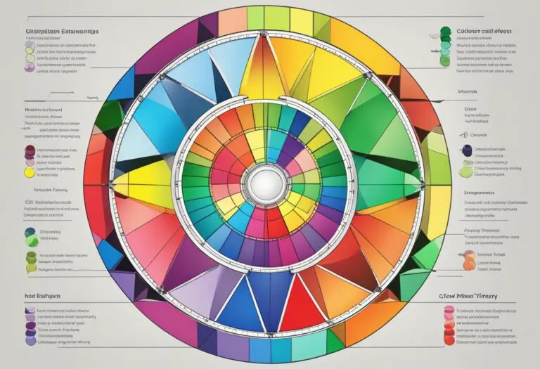
The color wheel is a visual representation of the spectrum of colors, arranged in a circular format. It consists of primary colors, secondary colors, and tertiary colors, each situated in specific positions that denote their relationships with one another.
The primary colors, which cannot be created by mixing other colors, are red, blue, and yellow. By combining these primary colors, secondary colors are formed. The secondary colors include orange, green, and violet.
Tertiary colors are created by mixing primary and secondary colors together. These colors lie between the primary and secondary colors on the color wheel and provide a greater range of hues and tones for artists to work with.
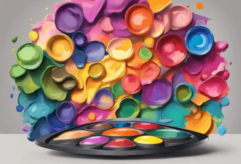
Analogous Painting Colors
One of the key concepts in color theory is the use of analogous colors. Analogous colors are colors that are adjacent to each other on the color wheel. They share similar characteristics and create a harmonious visual effect when used together in a painting.
When an artist selects analogous colors for their artwork, they are opting for a color scheme that provides unity and coherence. By choosing colors that are closely related, artists can achieve a sense of balance and create a pleasing visual experience for the viewer.
The Role of Complementary Colors
In addition to understanding analogous colors, it is important to recognize the significance of complementary colors in color theory. Complementary colors are located opposite each other on the color wheel and create strong contrasts when used together.
By using complementary colors in a painting, artists can create a dynamic visual impact and enhance the vibrancy of their artwork. Complementary colors have a way of intensifying each other, making them a valuable tool for artists who want to create a bold and captivating composition.
By delving deeper into color theory and understanding the relationships between colors on the color wheel, artists can unlock a world of creative possibilities. Whether working with analogous painting colors to achieve harmony or employing complementary colors to create contrast, mastering color theory is essential for any artist looking to create impactful and visually compelling artwork.
Exploring Analogous Painting Techniques

When it comes to creating artworks using analogous painting colors, artists have a repertoire of techniques at their disposal. These techniques allow them to blend, layer, and apply analogous colors in ways that achieve desired effects and enhance color harmony in their paintings.
Blending is a fundamental technique in analogous painting. It involves seamlessly transitioning between colors to create smooth transitions and gradations. Artists can use various tools, such as brushes or palette knives, to achieve different blending effects. By skillfully blending analogous colors, artists can create subtle variations and visual interest within their compositions.
Layering is another technique commonly employed with analogous colors. Artists can build up layers of paint in order to create depth and texture in their artwork. Through layering, they can add richness and complexity to their compositions, enhancing the overall visual impact.
Applying analogous colors strategically is crucial for achieving color harmony in paintings. Artists carefully consider the arrangement of colors within their compositions to create a sense of balance and unity. They can choose to use analogous colors as the dominant palette, while introducing small touches of contrasting colors to create visual interest and variety.
Specific techniques like glazing or scumbling can also be employed when working with analogous colors. Glazing involves applying transparent layers of paint over previously dried layers, allowing underlying colors to show through. This technique can enhance the luminosity and depth of the colors. Scumbling, on the other hand, involves applying thin, opaque layers of paint over dry layers, creating a textured effect. Both glazing and scumbling can be used strategically to enhance the visual impact of analogous color schemes.
Analogous painting techniques offer artists a wide range of possibilities to explore and express their creativity. By mastering these techniques, artists can create artworks that captivate viewers with their harmonious color palettes and skillful execution.
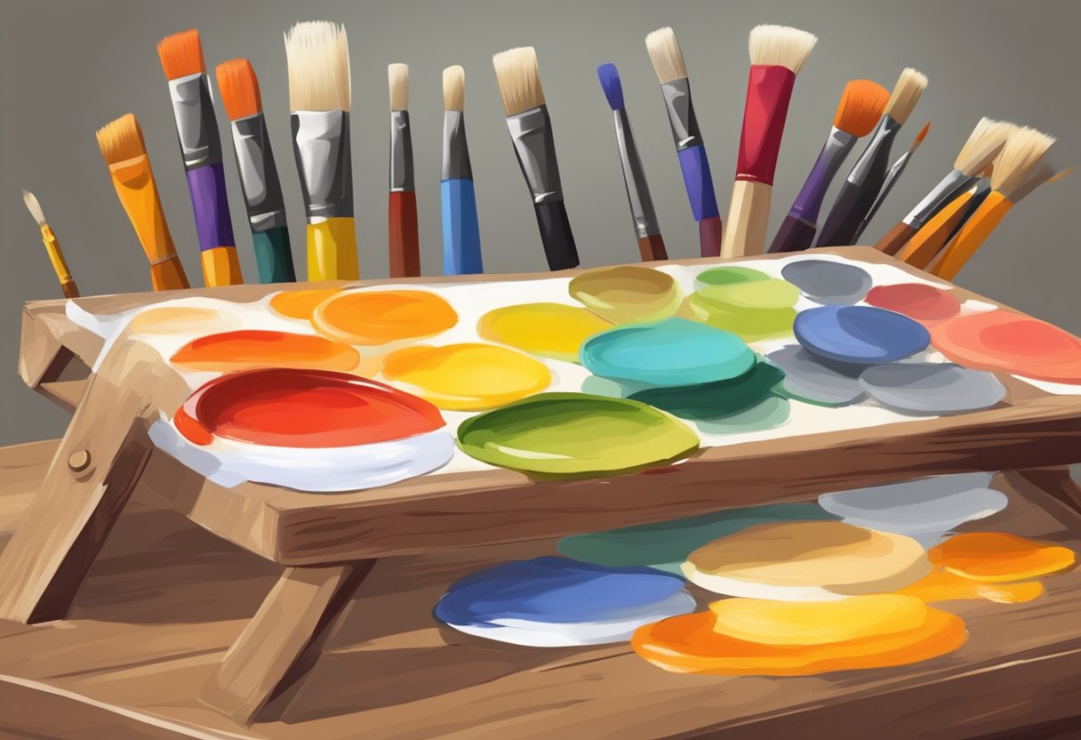
Selecting Art Supplies for Analogous Painting
When it comes to creating artwork with analogous colors, selecting the right art supplies plays a crucial role in achieving optimal results. Whether you are a beginner or an experienced artist, having the appropriate tools can greatly enhance your creative process and help you bring your vision to life.
Paint
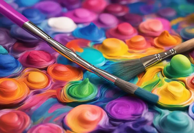
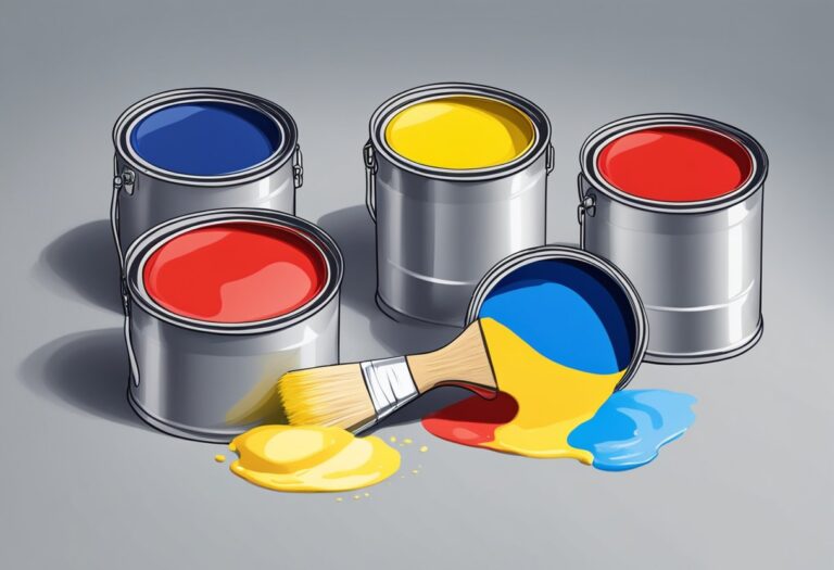
One of the most important considerations when choosing art supplies for analogous painting is the type of paint you use. Opt for high-quality paints that offer a wide range of colors, including those that closely align with your desired analogous color scheme. Acrylic paints are a popular choice for their versatility and vibrant pigment, while oil paints provide a rich and smooth texture.
Brushes
A variety of brushes is essential for applying and blending colors effectively. Look for brushes with different shapes and sizes, allowing you to achieve varying brushstrokes and levels of detail. Flat brushes are ideal for larger areas and broad strokes, while round brushes are perfect for fine lines and intricate details. Experiment with different brush types to find what works best for your artistic style.
Palettes
A suitable palette helps you organize and mix your analogous colors effectively. Consider using a palette with separate wells or compartments for each color, allowing you to keep them separate yet easily accessible. Alternatively, a mixing palette with a smooth surface can be used to blend colors seamlessly. Whichever type you choose, make sure it is easy to clean and durable.
Other Materials
In addition to paints, brushes, and palettes, there are other materials that can aid in your exploration of analogous painting colors. Palette knives are useful for creating texture and applying paint with precision. Masking tape or frisket can help create clean edges and protect certain areas of your artwork. Don’t forget to stock up on essential items like water containers, rags or paper towels, and a sturdy easel or drawing board to support your artwork.
By selecting high-quality art supplies that are compatible with your chosen painting techniques and color scheme, you set yourself up for success in capturing the beauty of analogous colors in your artwork. Investing in the right tools allows you to fully explore the visual harmony and expressive possibilities that analogous painting colors offer in the realm of visual arts.
Mixing Analogous Colors
Creating dynamic and vibrant artwork requires a thorough understanding of color mixing and its application. In this section, we will explore the process of mixing analogous colors, providing practical tips and techniques to expand your color palette and achieve desired hues and tones.
Blending Analogous Colors
When mixing analogous colors, it’s essential to start with a solid foundation. Begin by selecting colors from the color wheel that are next to each other to create a harmonious blend.
One popular technique is to mix primary colors with neighboring secondary colors. For instance, blending blue and green creates a serene cyan shade, while combining red and orange produces a warm vermilion tone.
To achieve a smooth blend, use a palette knife or a clean brush to gradually mix the colors together. Apply light pressure and make small strokes to ensure a seamless transition between the shades.
Combining Analogous Colors
Another approach to mixing analogous colors is to combine them in varying proportions. Experiment with different ratios to create unique shades and intensities.
For instance, mixing equal parts of red-violet and red-orange can result in a rich, deep maroon color. On the other hand, adding more red-violet to the mix will produce a cooler burgundy shade.
The key to successful color combinations is to observe the visual impact of each addition. Gradually build up the mixture until you achieve the desired color, and remember to take note of the proportions for future reference.
Color Mixing Theories
Color mixing involves both artistic intuition and scientific principles. Understanding color theory can help guide your mixing decisions and deepen your comprehension of analogous colors.
One widely recognized theory is the subtractive color model, which is used in traditional painting. It states that by mixing primary colors (red, blue, yellow) and their derivatives, you can create all other hues.
| Primary Colors | Secondary Colors |
|---|---|
| Red | Red-Orange |
| Blue | Blue-Green |
| Yellow | Yellow-Green |
By familiarizing yourself with color mixing theories and experimenting with different combinations, you can develop a deeper understanding of analogous colors and their potential.
Remember to keep a record of your mixing experiments by jotting down the color ratios or keeping samples of the resulting hues. This way, you can easily recreate and refine your favorite mixes in future artworks.
Achieving Color Harmony with Analogous Colors
In the world of visual arts, color plays a crucial role in creating impactful and harmonious compositions. One effective technique that artists employ to achieve color harmony is working with analogous colors. An analogous color scheme is composed of colors that are adjacent to each other on the color wheel, creating a sense of cohesion and balance.
Color harmony is the art of combining colors in a way that pleases the eye and evokes a specific emotional response. When working with analogous painting colors, artists can create visually pleasing and harmonious artworks by harnessing the inherent relationships between these colors.
By using colors that sit next to each other on the color wheel, artists can establish a natural progression in their compositions. This progression enhances the overall visual flow, guiding the viewer’s eye across the artwork. It also creates a sense of unity and cohesiveness within the piece.
When selecting analogous colors, artists can experiment with different hues, saturations, and values. For example, a painter working with blues and greens might choose various shades and tones within that color range. This variation adds interest and depth to the artwork while maintaining the harmonious relationship between the colors.
Another way to achieve color harmony with analogous colors is through the use of temperature. Warm analogous colors, such as red, orange, and yellow, can evoke feelings of energy and vitality. On the other hand, cool analogous colors, like green, blue, and violet, can create a sense of calm and tranquility. By manipulating the temperature of the colors, artists can further enhance the emotional impact of their artwork.
Practical Tips for Achieving Color Harmony
Here are some practical tips for artists looking to achieve color harmony using analogous colors:
- Start with a dominant color: Begin by selecting a dominant color from the analogous color scheme. This color will set the tone and serve as the foundation for the entire composition.
- Gradually introduce adjacent colors: Introduce the adjacent colors from the analogous color scheme, gradually transitioning from the dominant color to the neighboring hues.
- Consider value and saturation: Experiment with different values and saturations of the analogous colors to create contrast and depth within the composition. Use lighter and more vibrant shades to draw attention, and darker or desaturated shades to add depth or create a focal point.
- Explore color proportions: Play with the proportions of each color within the composition. Consider using the dominant color as the main area of focus, while using the adjacent colors as supporting elements to guide the viewer’s eye.
- Use neutral tones: Incorporate neutral tones, such as grays or earthy shades, to provide balance and prevent the analogous color scheme from becoming overwhelming.
By following these tips and experimenting with different combinations, artists can achieve stunning color harmony using analogous colors in their paintings. The possibilities are endless, allowing for the creation of unique and visually captivating artworks.
| Analogous Color Scheme Examples | Artwork Examples |
|---|---|
 |
|
Creating Dynamic Artwork with Analogous Painting Colors
When it comes to creating visually captivating artwork, utilizing analogous painting colors can make a significant difference. By understanding how to effectively use these colors, artists can enhance the impact of their compositions and create dynamic pieces that engage the viewer’s eye.
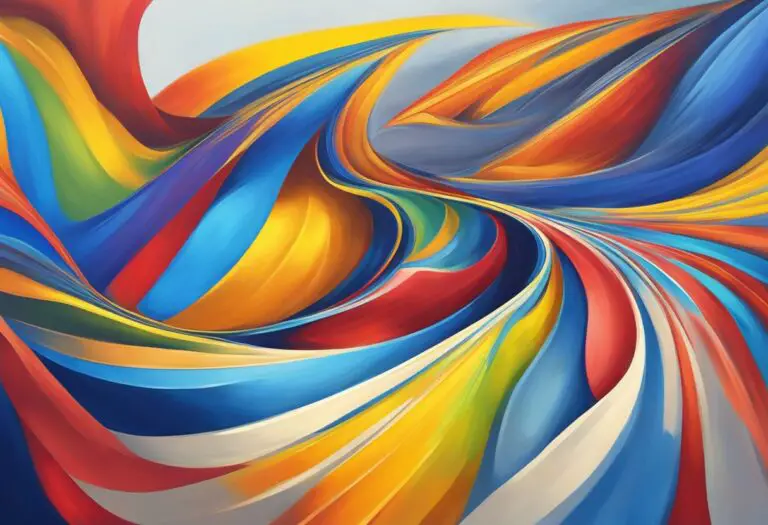
Analogous painting colors refer to colors that are adjacent to each other on the color wheel, such as red, orange, and yellow or blue, violet, and red. This harmonious color scheme creates a sense of unity and coherence in the artwork, making it visually appealing.
One approach to maximizing the impact of analogous colors is to create contrast within the composition. By juxtaposing different shades and tones of analogous colors, artists can add depth and interest, guiding the viewer’s gaze and creating visual tension. For example, using a darker shade of red alongside a lighter shade of orange can enhance the vibrant energy of the artwork.
Texture is another element that can contribute to the dynamic nature of artworks using analogous colors. Artists can experiment with different painting techniques to create varied textures within the painting. The juxtaposition of smooth and rough surfaces can add visual interest and tactile appeal to the artwork, further enhancing its impact.
It’s important to note that analogous colors can be used in a variety of artistic styles or genres. Whether working with abstract art, landscapes, portraits, or still life, artists can adapt analogous color schemes to suit their artistic vision. By understanding the principles of color theory and painting techniques, artists can effectively utilize analogous colors to create artwork that stands out in the visual arts realm.
Overall, creating dynamic artwork with analogous painting colors requires a thoughtful approach to color composition, contrast, and texture. By exploring different techniques and experimenting with various analogous color combinations, artists can push the boundaries of their creativity and captivate viewers with visually engaging artworks.
Exploring Analogous Painting in Different Art Forms
While analogous painting colors are commonly associated with traditional painting, their versatility extends beyond this medium. Artists across various art forms, including digital art, sculpture, and textile design, have harnessed the power of analogous colors to evoke emotions, create visual impact, and achieve harmonious compositions.
In digital art, analogous color schemes are used to create vibrant and cohesive digital illustrations, graphic designs, and animations. Artists utilize color palettes composed of closely related hues to establish a sense of unity and balance in their digital creations. By strategically selecting analogous colors, digital artists can guide the viewer’s eyes and create a dynamic visual experience.
Sculptors also employ analogous color combinations to enhance the aesthetics and storytelling of their three-dimensional artworks. From bronze sculptures to contemporary installations, the thoughtful use of analogous colors adds depth, dimension, and visual interest to sculptural pieces. Artists deliberately select analogous colors to create contrasts and highlights, adding a sense of realism or abstraction to their sculptures.
Textile designers incorporate analogous painting colors to bring vibrancy and cohesion to their fabric creations. Whether it’s printed patterns, woven textiles, or dyed garments, analogous colors play a crucial role in determining the overall mood and impact of the design. By skillfully blending and juxtaposing analogous hues, textile artists can create captivating and harmonious fabrics that stand out and engage the viewer.
Table: Examples of Analogous Painting Colors in Different Art Forms
| Art Form | Analogous Painting Colors | Example |
|---|---|---|
| Digital Art | Green, Blue-Green, Blue | Illustration of a serene underwater scene |
| Sculpture | Red, Orange, Orange-Red | Abstract sculpture featuring warm, fiery tones |
| Textile Design | Purple, Blue-Purple, Blue | Printed fabric with a rich and harmonious color palette |
Exploring analogous painting colors beyond traditional painting opens up new avenues for artistic expression. By embracing analogous color schemes in different art forms, artists can push boundaries, experiment with different textures and materials, and create captivating and visually impactful artworks.
Examples and Inspirations for Analogous Painting Colors
When working with analogous painting colors, artists can find inspiration from renowned masters who have effectively utilized these harmonious color schemes in their artwork. Studying their techniques and exploring their palettes can provide valuable insights and spark creativity. Here are some notable examples:
Pierre-Auguste Renoir
Renoir, the French Impressionist painter, was known for his vibrant and expressive use of color. His use of analogous colors, particularly warm tones like reds, oranges, and yellows, created an uplifting and lively atmosphere in his paintings.
Georgia O’Keeffe
O’Keeffe, an American modernist artist, often used analogous shades of blues, greens, and purples to capture the essence and beauty of natural landscapes. Her meticulous attention to color and form made her paintings visually striking and captivating.
In addition to these artists, there are countless others who have explored the potential of analogous painting colors in their works. By studying their techniques and color choices, artists can gain a deeper understanding of how to effectively create harmonious and visually compelling artwork.
Artists looking for further inspiration can also explore various resources that provide guidance and ideas for working with analogous colors. Books such as “Color and Light: A Guide for the Realist Painter” by James Gurney and websites like “The Virtual Instructor” offer valuable insights and practical tips.
Conclusion
Throughout this article, we have explored the fascinating world of analogous painting colors and their role in creating harmonious artwork. Understanding color theory and mastering various painting techniques are crucial in achieving color harmony and visual impact. By working with analogous colors, artists can create dynamic and visually engaging artwork that captures the viewer’s attention.
Color theory serves as the foundation for understanding the relationships between colors on the color wheel. By selecting analogous painting colors, artists can create cohesive and balanced compositions. Whether it’s blending, layering, or applying analogous colors, painting techniques play a vital role in enhancing the desired effects and achieving color harmony.
As visual artists, it is essential to explore and experiment with analogous painting colors. By expanding our knowledge of color theory and embracing different painting techniques, we can unlock a world of artistic possibilities. Analogous painting colors provide a versatile palette that can be used across various art forms, from traditional painting to digital art, sculpture, and textile design.