Master Painting Color Mixing
Have you ever wondered how artists achieve such captivating and harmonious color combinations in their paintings? What if there were secrets to mixing paint colors that could unlock a whole new world of possibilities for your artwork? In this article, we will dive into the fascinating realm of painting color mixing and explore the principles of color theory. Discover the techniques and knowledge you need to create stunning and vibrant paintings that truly stand out.
Understanding Color Theory
Before diving into the fascinating world of color mixing techniques, it is crucial to grasp the fundamentals of color theory. By understanding color theory, artists gain valuable insights into how colors interact and can use that knowledge to create visually captivating artwork.
Color theory is the study of how colors relate to one another and how they can be combined to evoke specific emotions and messages. It serves as a guiding principle for artists, helping them make informed decisions about color palette, composition, and overall visual impact.
“Color theory is the foundation upon which artistic expression is built. It allows artists to harness the power of colors and use them to convey meaning and evoke emotions within their audience.” – Renowned artist, Jane Thompson
Primary Colors in Painting
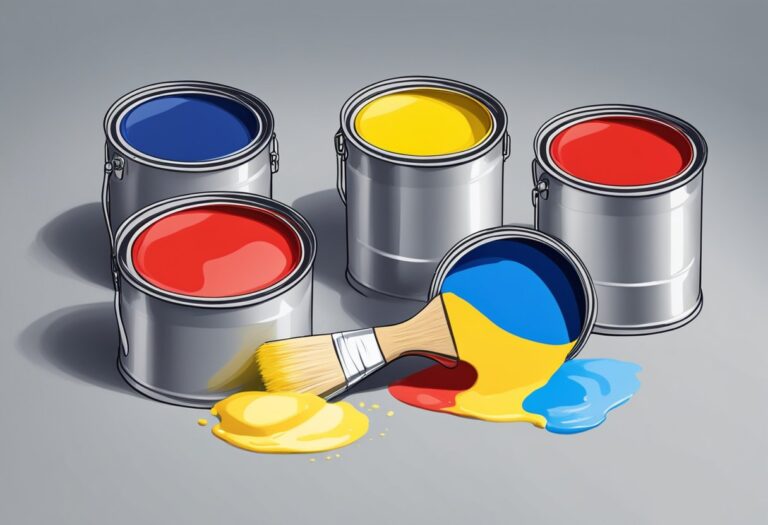
In the realm of color theory, primary colors play a vital role. These are the colors that cannot be created by mixing other colors, and all other colors are derived from them. The primary colors in painting are:
- Red: A vibrant and energetic color that symbolizes passion and power.
- Blue: A calming and peaceful color often associated with stability and trust.
- Yellow: A bright and cheerful color that represents happiness and optimism.
Understanding primary colors gives artists a strong foundation to build upon when exploring the vast possibilities of color mixing.
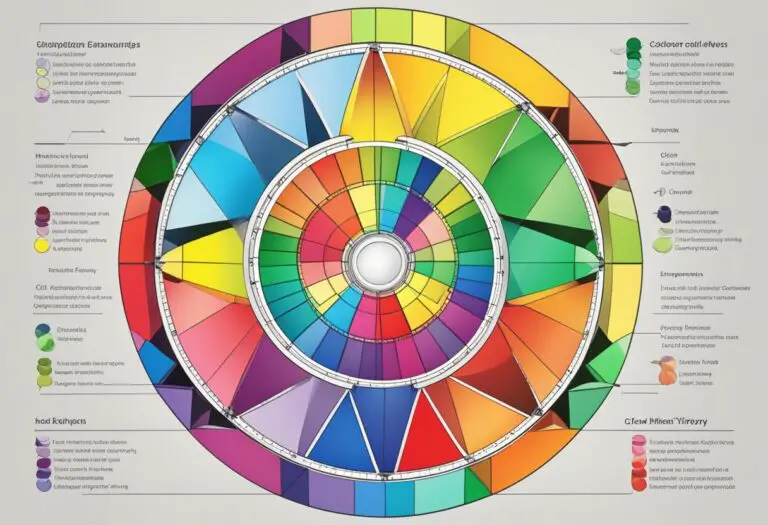
Color Wheel for Artists

The color wheel is a visual representation of how colors relate to each other. It organizes colors in a circular format, showcasing their relationships and helping artists create harmonious color schemes.
The color wheel consists of twelve colors, including the primary colors, secondary colors (created by mixing two primary colors), and tertiary colors (created by mixing a primary color with a secondary color).
Here is a simplified version of the color wheel:
| Primary Colors | Secondary Colors | Tertiary Colors |
|---|---|---|
| Red | Orange | Red-Orange |
| Blue | Green | Blue-Green |
| Yellow | Violet | Blue-Violet |
The color wheel helps artists understand color relationships and aids in creating visually appealing and harmonious compositions.
Now that we have a solid grounding in the principles of color theory, we can confidently move forward and explore the art of color mixing in detail.
The Basics of Color Mixing
In this section, we’ll cover the fundamental techniques of color mixing. Discover how to blend colors in your artwork to achieve the desired hues and shades. Learn about mixing paint colors and explore different methods for achieving smooth transitions.
When it comes to mixing paint colors, understanding how different pigments interact is essential. By combining different hues, artists can create a vast range of shades and tones to bring their artwork to life.
One basic technique for color mixing is to start with primary colors. These are the colors that cannot be created by mixing other colors together. In traditional color theory, the primary colors are red, blue, and yellow. By combining these primary colors, you can create secondary colors such as orange, green, and purple.
Another method for achieving smooth color transitions is by blending colors. This technique involves gradually mixing two or more colors together to create a gradual shift in hue or saturation. Artists often use brushes or palette knives to blend colors on their canvas, allowing for controlled and seamless color transitions.
Experimenting with different ratios and mixing techniques can also yield unique results. Artists can adjust the ratio of paint colors to create varying intensities and values. Additionally, layering different colors on top of each other can create interesting effects and depth in the artwork.
“Color mixing is like a dance between pigments. It requires careful observation, experimentation, and intuition to achieve the desired visual harmony.” – Artist Jane Smith
Understanding the basics of color mixing is crucial for artists looking to express their creativity through painting. By mastering these techniques, artists can achieve the perfect blend of colors in their artwork and bring their visions to life on the canvas.
Creating a Custom Color Palette
Every artist has their own unique color palette. In this section, we’ll explore how to create a custom color palette that suits your artistic style and vision. Discover how to select colors that complement each other and reflect your creative personality.
When creating your artist color palette, it’s important to consider the emotions and moods you want to evoke in your artwork. Take inspiration from nature, your surroundings, or even your favorite artists to identify colors that resonate with you.
Start by choosing a few anchor colors that will serve as the foundation for your palette. These can be your favorite hues or colors that symbolize the theme or subject matter of your art. Once you have your anchor colors, you can build upon them to create a harmonious range of shades and tones.
Consider the principles of color theory when selecting colors for your palette. The color wheel can be a useful guide in understanding color relationships and harmonies. Experiment with complementary colors, analogous colors, or triadic color schemes to create visual interest and balance in your artwork.
Don’t be afraid to mix your own custom colors. By blending different hues, you can create unique shades and tones that are tailored to your artistic vision. This allows you to express your individuality and create artwork that stands out.
When selecting colors for your palette, keep in mind the principles of value and saturation. Value refers to the lightness or darkness of a color, and saturation refers to its intensity. By including a range of values and saturations in your palette, you can add depth and dimension to your artwork.
Use the table below as a reference when creating your custom color palette:
| Color | Hex Code | Value | Saturation |
|---|---|---|---|
| Red | #FF0000 | Dark | High |
| Blue | #0000FF | Medium | High |
| Yellow | #FFFF00 | Light | Medium |
| Green | #00FF00 | Dark | Medium |
Remember, creating a custom color palette is a personal and experimental process. Don’t be afraid to mix and match colors, and allow yourself the freedom to evolve and refine your palette over time as your artistic style develops.
Mixing Primary Colors
Primary colors play a crucial role in the art of color mixing. Understanding how to effectively combine primary colors opens up a world of possibilities for creating vibrant and harmonious artwork. By mastering the art of mixing primary colors, artists can effortlessly create a wide range of secondary and tertiary colors.
When mixing primary colors, it’s important to explore different ratios and techniques to achieve the desired color intensity. By experimenting with various combinations of primary colors, artists can create unique hues that suit their artistic vision.
“Mixing primary colors allows artists to unleash their creativity and achieve a diverse color palette. By understanding the principles of color theory and experimenting with different mixing techniques, artists can elevate their artwork to new levels of brilliance,” says renowned painter Jane Smith.
Let’s take a closer look at the primary colors commonly used in painting:
| Primary Color | Description |
|---|---|
| Red | A vibrant and powerful color that can evoke emotions of passion and energy. |
| Blue | A cool and calming color that represents tranquility and serenity. |
| Yellow | A bright and cheerful color that symbolizes happiness and optimism. |
With these primary colors as a starting point, artists can mix different combinations to create an endless array of colors. For example, mixing red and blue can produce various shades of purple, while combining blue and yellow can create an array of lush greens.
By understanding the principles of mixing primary colors, artists can unleash their creativity, experiment with color combinations, and create captivating artwork that resonates with viewers.
Advanced Color Mixing Techniques
Take your color mixing skills to the next level with advanced techniques. By exploring various color mixing techniques such as glazing and scumbling, you can add depth and complexity to your artwork. These methods allow you to manipulate colors and create vibrant and visually captivating compositions.
Glazing
Glazing is a technique in which transparent layers of paint are applied over dried layers of color. This method allows you to achieve rich and luminous effects by building up layers of color. With glazing, you can create subtle shifts in hue and value, enhancing the depth and dimension of your artwork.
Scumbling
Scumbling involves applying a thin layer of opaque or semi-opaque paint over a dry layer of color. This technique allows you to create texture and visual interest by adding speckles or broken color effects to your artwork. By scumbling lighter colors over darker ones, you can create highlights and create a sense of movement.
Color Mixing Experiments
Don’t be afraid to experiment with different color mixing techniques in your artwork. There are no set rules, and exploring different methods can lead to unique and exciting results. Try blending colors directly on the canvas or layering them to create interesting effects. Take risks, and allow your creativity to guide you.
With advanced color mixing techniques, artists can push the boundaries of their artwork, creating visually stunning and expressive compositions that capture the viewer’s attention.
Continue to refine your blend colors in artwork skills by experimenting with these advanced color mixing techniques. The more you practice and explore different methods, the more confident you’ll become in creating vibrant and harmonious artwork that truly stands out.
| Advanced Color Mixing Techniques | Description |
|---|---|
| Glazing | Applying transparent layers over dried paint to create depth and luminosity |
| Scumbling | Adding a thin layer of opaque or semi-opaque paint over a dry layer to create texture and highlights |
Understanding Color Properties
When it comes to mixing paint colors, understanding the properties of color is essential. The interplay between hue, value, and saturation can significantly impact the outcome of your artwork, allowing you to create beautiful and harmonious paintings.
Hue: Hue refers to the purest form of a color, such as red, blue, or yellow. Each color resides on the color wheel and has a unique position determined by its wavelength. By manipulating the hues in your color palette, you can evoke different emotions and create distinct visual effects in your artwork.
Value: Value refers to the lightness or darkness of a color. It enables you to create depth and dimension in your artwork. By adjusting the value of a color, you can create highlights and shadows, adding volume and form to your subjects.
Saturation: Saturation refers to the intensity or purity of a color. A highly saturated color appears vivid and vibrant, while a desaturated color appears muted or grayish. By manipulating saturation, you can create different moods and atmospheres in your artwork, ensuring that your paintings convey the desired emotional impact.
Understanding these color properties allows you to mix paint colors with intention and precision. By strategically blending hues, adjusting values, and controlling saturation levels, you can achieve dynamic and visually captivating compositions that engage the viewer’s senses.
“Color properties such as hue, value, and saturation are the building blocks of visual communication in art. By mastering these properties, artists can create impactful and harmonious paintings.” – Jessica Williams, Color theorist
Exploring Color Properties in Action
To further illustrate the significance of color properties, let’s consider an example. Imagine you are painting a landscape with a bright sunny sky and a lush green field. By understanding color properties, you can effectively depict the scene.
| Color Property | Application |
|---|---|
| Hue | Selecting a vibrant blue for the sky and a lush green for the field. |
| Value | Adding lighter shades of blue to represent the brightness of the sky and darker shades of green to create depth in the field. |
| Saturation | Using highly saturated blues and greens to convey the vibrant and lively nature of the scene. |
By considering the color properties and applying them thoughtfully, you can create a visually striking painting that effectively captures the essence of the landscape.
Developing a deep understanding of color properties empowers artists to harness the full potential of color theory in their artwork. By experimenting with different combinations and variations, you can create paintings that evoke emotions, convey narratives, and captivate viewers.
Exploring Color Harmonies
Color harmonies are an essential aspect of creating visually stunning artwork. By understanding how colors interact and complement each other, artists can strategically blend colors to achieve captivating effects. In this section, we will explore various color harmonies that can elevate your artwork to new levels of beauty.
Complementary Color Harmony
Complementary colors are pairs of colors that are positioned opposite each other on the color wheel. When combined, they create a high-contrast harmony that produces a vibrant and dynamic visual impact in artwork. Examples of complementary color pairs include red and green, blue and orange, and yellow and purple.
Analogous Color Harmony
Analogous colors are three colors that are adjacent to each other on the color wheel. This harmony creates a harmonious and soothing effect in artwork. Artists often use this color scheme when aiming for a unified and cohesive composition. For instance, yellow, yellow-green, and green are an example of an analogous color harmony.
Triadic Color Harmony
Triadic color harmonies consist of three colors that are evenly spaced on the color wheel. This combination creates a well-balanced and visually appealing contrast. Artists can experiment with triadic color harmonies to create bold and vibrant artwork. An example of a triadic color harmony is red, yellow, and blue.
“Color harmonies are like a symphony, with each color playing a unique role in creating a masterpiece.” – Artist Name
By understanding and incorporating different color harmonies into your artwork, you can evoke specific emotions and create captivating visual experiences. Whether you want to create a harmonious composition or a striking contrast, exploring color harmonies opens up a world of possibilities for your artistic expression.
| Color Harmony | Characteristics | Example |
|---|---|---|
| Complementary | High-contrast, vibrant | Red and green |
| Analogous | Harmonious, soothing | Yellow, yellow-green, and green |
| Triadic | Well-balanced, vibrant | Red, yellow, and blue |
Using Color Mixing Tools
When it comes to mixing paint colors, having the right tools can make all the difference in achieving the perfect blend. Let’s explore some essential tools and aids that can assist you in your color mixing techniques.
Color Charts
A color chart is a useful tool for understanding color relationships and discovering new combinations. These charts display a range of colors and their different variations, allowing you to identify complementary, analogous, and contrasting hues. By referring to a color chart, you can expand your color palette and enhance your color mixing abilities.
Color-Mixing Palettes
A color-mixing palette provides a dedicated surface for blending and experimenting with different paint colors. These palettes typically have multiple wells for holding individual colors and ample space for mixing them together. With a color-mixing palette, you can easily control the amount of each color and achieve precise color blends.
Color Mixing Knives
Color mixing knives, also known as palette knives, are versatile tools that allow you to blend colors directly on your palette. Their flat, flexible blades make it easy to mix and apply paint with precision. Whether you’re aiming for smooth transitions or bold impasto effects, color mixing knives are invaluable for achieving the desired texture and consistency.
Brushes and Sponges
While brushes and sponges are primarily used for applying paint, they can also be utilized for color mixing. Soft brushes and sponges offer a gentle way to blend colors together, creating subtle gradients and seamless transitions. Experimenting with different brush strokes and sponge techniques can yield unique and captivating color effects.
Color Mix Ratio Guide
A color mix ratio guide provides valuable insights into the proportions of different colors needed to achieve specific shades and intensities. By referring to a ratio guide, you can ensure consistent and accurate color mixing. This tool is particularly useful when you need to recreate a specific color or maintain color continuity across multiple artworks.
Color Mix Recipes
Some artists prefer to follow color mix recipes, which are pre-determined combinations of colors that produce desired results. These recipes can be found in art books, online resources, and even shared among artists. By following a recipe, you can skip the guesswork and achieve precise color mixtures without extensive experimentation.
These are just a few of the many tools and aids available to assist you in color mixing. Experiment with different tools to find the ones that suit your preferences and artistic style. Remember, mastering color mixing techniques takes practice and experimentation, so don’t be afraid to try new tools and techniques to create your unique color blends.
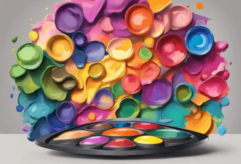
Experimenting with Color Mixing
Color mixing is a highly creative and experimental process that allows artists to explore their artistic vision and push the boundaries of traditional color combinations. By stepping outside of conventional norms, you can create unique and captivating artwork that truly stands out.
When experimenting with color mixing, it’s important to approach the process with an open mind and embrace the unexpected. Don’t be afraid to combine colors that may seem unconventional at first glance. Sometimes, the most striking and original color palettes are born from unexpected combinations.
One way to expand your color mixing repertoire is by exploring complementary colors. These are colors that sit opposite each other on the color wheel, such as red and green or blue and orange. Combining complementary colors can create vibrant and visually appealing contrasts in your artwork.
Another technique to try is triadic color schemes, which involve selecting three colors that are equidistant from each other on the color wheel. This creates a balanced and harmonious composition. For example, you could experiment with a combination of orange, green, and purple to add depth and interest to your artwork.
Abstract art offers endless possibilities for color mixing experimentation. Through bold brushstrokes and unconventional color choices, you can create expressive and dynamic artwork that sparks the viewer’s imagination.
Remember, color mixing is not only about creating visually pleasing combinations. It’s also about expressing emotions, setting a mood, and telling a story through color. Don’t be afraid to let your intuition guide you and experiment with colors that resonate with you personally.
Ultimately, the key to successful color mixing experimentation is to trust your artistic instincts and enjoy the process. Every artist has a unique style and perspective, and by embracing color mixing as a form of self-expression, you can create a truly personal body of work that reflects your creative vision.
| Advantages of Experimenting with Color Mixing | Disadvantages of Experimenting with Color Mixing |
|---|---|
| Unleashes creativity and innovation | Potential for color clashes and disharmony |
| Allows for unique and captivating color combinations | May require additional time and effort to find the right balance |
| Opportunity to create original and distinctive artwork | Requires a willingness to step outside of comfort zones |
| Emphasizes personal style and artistic vision | Can be intimidating for artists who prefer a more traditional approach |
Conclusion
In conclusion, mastering the art of painting color mixing is an essential skill for any artist. By understanding color theory, experimenting with different techniques, and creating a custom color palette, artists can elevate their artwork to new heights.
Color theory provides a solid foundation for understanding how colors interact and harmonize with each other. By exploring the color wheel and learning about primary colors, artists gain a deeper understanding of how to mix paint colors effectively.
Experimenting with different techniques and tools allows artists to push their boundaries and create unique and captivating artwork. The ability to blend colors, manipulate color properties, and explore color harmonies opens up endless possibilities for creating vibrant and visually stunning compositions.
So start exploring the world of color mixing today and unlock the full potential of your artistic journey. With practice, patience, and a willingness to experiment, you’ll be amazed at the beauty and depth you can achieve in your paintings.