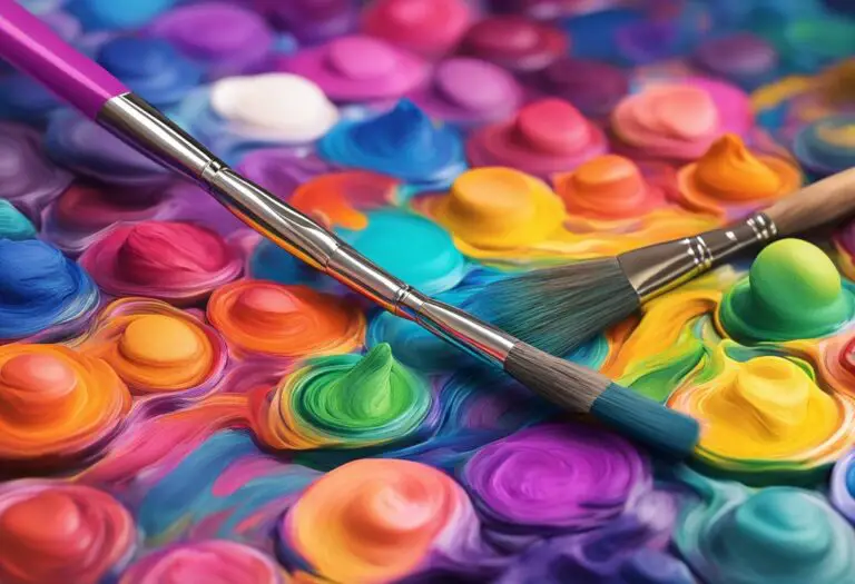
Triadic Painting Color Scheme: Vibrant Art Guide
Welcome to our in-depth guide on the triadic painting color scheme. In this article, we will explore the fundamentals of this vibrant art technique and its significance in creating visually striking artwork. Whether you’re a seasoned artist or just starting out, understanding and utilizing the triadic painting color scheme can elevate your artwork to new levels of vibrancy and harmony.
Understanding Triadic Color Scheme
The triadic painting color scheme is a powerful tool in an artist’s arsenal to create visually captivating and harmonious artwork. To comprehend this scheme fully, it is essential to grasp the fundamentals of color theory, primary colors, and secondary colors.
Color theory is the study of how colors interact and affect one another in artistic compositions. It explores the psychological and emotional impact of different color combinations. Understanding color theory is crucial for artists who want to create artwork that resonates with viewers on a deeper level.
Primary colors are the building blocks of all other colors. In the traditional color theory, the three primary colors are red, blue, and yellow. These colors cannot be created by mixing other colors and are used as a base for creating various hues and tones.
Secondary colors, on the other hand, are created by mixing two primary colors. The three secondary colors are orange (created by mixing red and yellow), green (created by mixing blue and yellow), and purple (created by mixing red and blue). These colors offer a broader palette for artists to work with and enhance the vibrancy of their artwork.
When applied to the triadic color scheme, the primary and secondary colors form a harmonious trio. The three colors are evenly spaced on the color wheel, creating a dynamic and balanced composition. For example, a triadic color scheme could consist of red, blue, and yellow or orange, green, and purple.
To better understand the concept, here’s a breakdown of the triadic color scheme:
| Primary Colors | Secondary Colors |
|---|---|
| Red | Orange |
| Blue | Green |
| Yellow | Purple |
By incorporating primary and secondary colors in their artwork, artists can achieve a vibrant and visually striking result. The triadic color scheme allows for endless combinations and possibilities, encouraging experimentation and pushing the boundaries of creativity.
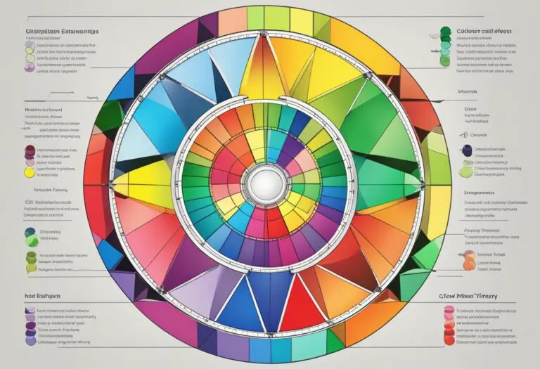
The Color Wheel and Triadic Harmony
The color wheel is a fundamental tool in understanding and creating triadic harmony within the context of the triadic painting color scheme. It provides a visual representation of the relationship between colors and allows artists to explore different combinations that result in balanced and harmonious compositions.
The color wheel consists of twelve hues, arranged in a circular format. At its core are the primary colors: red, yellow, and blue. These colors are considered the building blocks of all other colors and cannot be created by mixing other colors together. They serve as the foundation for the triadic color scheme.
Adjacent to the primary colors on the color wheel are the secondary colors: orange, green, and purple. These colors are created by mixing equal parts of two primary colors together. For example, red and yellow combine to create orange, yellow and blue create green, and blue and red create purple.
By using the color wheel, artists can identify and select three colors that are equidistant from each other, creating a triadic color scheme. The resulting color combination ensures a balanced distribution of warm and cool tones, adding visual interest and harmony to the artwork.
When working with a triadic color scheme, it is essential to consider the intensity or saturation of the chosen colors. Artists can experiment with different hues, shades, and tints within the triadic color scheme to create depth and variation in the composition.
Here is an example of a triadic color scheme created using the color wheel:
Triplicate Blossoms
| Color | Hue | RGB Code |
|---|---|---|
| Red | Primary | |
| Yellow | Primary | |
| Blue | Primary |
In the “Triplicate Blossoms” example, a triadic color scheme is achieved by combining the primary colors: red, yellow, and blue. These colors create a vibrant and balanced composition, with each color complementing and enhancing the others.
The color wheel acts as a guide for artists utilizing the triadic painting color scheme, enabling them to navigate the vast array of color options and create harmonious and visually appealing artwork.
Complementary Colors in Triadic Palette
In the world of art and design, the triadic painting color scheme offers a vibrant and visually striking approach to creating artwork. One key element in this scheme is the use of complementary colors, which play a significant role in enhancing the overall impact of the artwork.
Complementary colors are pairs of colors that are positioned opposite each other on the color wheel. When combined, they create a strong contrast that adds energy and dynamism to the composition. In the context of a triadic palette, complementary colors are selected from the three colors that form the triad, creating a harmonious balance that captivates the viewer’s attention.
By incorporating complementary colors within a triadic palette, artists can achieve stunning color combinations that evoke depth and visual interest. The bold contrast between these colors creates a vibrant and lively atmosphere in the artwork, making it visually captivating and engaging.
For example, in a triadic palette consisting of the primary colors (red, blue, and yellow), the complementary pairs would be red and green, blue and orange, and yellow and purple. These complementary color combinations can be used strategically to highlight certain elements of the artwork or to create focal points that draw the viewer’s gaze.
Furthermore, the use of complementary colors in a triadic palette allows for a wide range of creative possibilities. Artists can experiment with different proportions and intensities of the complementary pairs to achieve various effects and moods in their artwork.
When implementing the complementary colors within a triadic palette, it is essential to consider the balance and unity of the overall composition. By carefully harmonizing these contrasting colors, artists can create a visually pleasing and cohesive artwork.
Example:
To illustrate the powerful impact of using complementary colors in a triadic palette, let’s take a look at a famous artwork: “Starry Night” by Vincent van Gogh. In this masterpiece, van Gogh effectively employs a triadic color scheme with complementary colors to enhance the visual impact and convey the ethereal, dream-like atmosphere of the night sky.
| Main Colors | Complementary Colors |
|---|---|
| Blue | Orange |
| Yellow | Purple |
| White | Dark Blue |
By pairing blue with orange and yellow with purple, van Gogh creates a visually captivating contrast that adds depth and dimension to the swirling night sky. The complementary colors intensify the overall impact of the artwork, making it a mesmerizing masterpiece that continues to inspire artists and art enthusiasts.
In conclusion, the use of complementary colors within a triadic palette offers artists a powerful tool to create visually dynamic and engaging artwork. By strategically incorporating these contrasting colors, artists can achieve stunning color combinations that captivate the viewer’s attention and evoke a range of emotions. The complementary colors elevate the impact of the triadic painting color scheme, elevating artwork to a whole new level.
Creating Contrast in Triadic Painting
In triadic painting, contrast plays a vital role in elevating the overall visual impact of the artwork. By strategically incorporating contrasting colors, artists can add depth and visual interest to their compositions. The juxtaposition of bold and subtle tones creates a dynamic interplay that captivates the viewer’s attention.
When working with a triadic painting color scheme, it’s essential to find the right balance between contrasting hues. This balance ensures that each color stands out while complementing the others. Utilizing contrasting colors in a triadic palette not only creates vibrancy but also emphasizes the distinctiveness of each color.
“Contrast is essential in art; without it, a composition can appear flat and lack dimension. In triadic painting, contrasting colors serve as the foundation for building captivating and visually engaging artworks.” – Artist Jane Thompson
There are several ways to create contrast within a triadic painting. One approach is to use a combination of warm and cool colors. Warm colors, such as reds and oranges, tend to advance and appear more prominent, while cool colors, like blues and greens, recede visually. This contrast in temperature creates a sense of depth and spatial differentiation in the artwork.
Another method is to pair saturated colors with desaturated or neutral tones. The saturated colors, with their intensity and vibrancy, command attention, while the desaturated or neutral colors provide a calming influence. This contrast between bold and subtle tones adds visual interest and contributes to the overall balance of the composition.
Contrast Techniques in Triadic Painting
In triadic painting, artists can employ various techniques to enhance contrast and create engaging visual effects. Some effective techniques to consider include:
- Color Blocking: Using distinct areas of contrasting colors to create bold and graphic compositions.
- Layering: Applying multiple layers of contrasting colors to achieve depth and complexity in the artwork.
- Glazing: Applying translucent layers of contrasting colors atop each other to create luminosity and richness.
By utilizing these techniques, artists can amplify the contrast within their triadic color schemes, resulting in striking and compelling artworks.
| Contrasting Triadic Color Combinations | Color Palette | Artwork Example |
|---|---|---|
| Red, yellow, and blue | Image of artwork | |
| Purple, orange, and green | Image of artwork | |
| Blue, red-orange, and yellow-green | Image of artwork |
These contrasting triadic color combinations demonstrate how different hues can be harmoniously integrated to create impactful compositions. By experimenting with various color contrasts, artists can discover unique and captivating ways to showcase their artistic vision.
Triadic Painting Techniques and Methods
Implementing the triadic painting color scheme requires a thoughtful approach and a repertoire of techniques and methods. By understanding how to effectively use painting techniques and combine colors, artists can create stunning artwork that showcases the vibrancy and harmony of the triadic color scheme.
Color Blocking
Color blocking is a popular technique used to highlight the distinctiveness of the triadic color scheme. By strategically applying solid blocks of each primary and secondary color, artists can create bold visual contrasts and emphasize the unique characteristics of each hue.
When employing color blocking, it’s important to consider the placement and proportion of each color. Experiment with different arrangements to achieve a balanced composition that captures the viewer’s attention and creates a sense of visual harmony.
Layering
Layering is another technique that can enhance the depth and complexity of a triadic painting. By building up layers of paint, artists can create rich, textured surfaces that bring out the subtleties and nuances of each color.
When layering, start with lighter colors as a base and gradually add layers of darker hues. This technique allows for the creation of intricate color interactions and transitions, adding visual interest and dimension to the artwork.
Glazing
Glazing is a technique that involves applying thin, translucent layers of paint over existing colors. It can be especially useful in harmonizing the colors within a triadic scheme and achieving a unified, cohesive appearance.
To glaze, mix a small amount of pigment with a glazing medium to create a transparent wash. Apply this glaze over areas of the painting to subtly modify the existing colors, creating smooth transitions and enhancing the overall color harmony.
“Color blocking, layering, and glazing are powerful techniques that every artist should explore when working with the triadic painting color scheme. These methods allow for the manipulation and blending of colors, resulting in vibrant compositions that captivate the viewer’s gaze.”
Comparing Triadic Painting Techniques and Methods
| Technique | Description | Benefits |
|---|---|---|
| Color Blocking | Applying solid blocks of each primary and secondary color |
|
| Layering | Building up layers of paint to create depth and complexity |
|
| Glazing | Applying translucent layers of paint to modify colors |
|
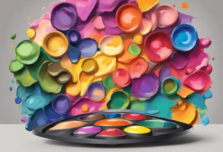
Exploring Triadic Color Combinations
When it comes to creating vibrant art, the triadic painting color scheme is a powerful tool for artists to unleash their creative potential. By combining three colors that are evenly spaced on the color wheel, this scheme offers a harmonious balance that adds a burst of energy to any artwork.
By exploring different triadic color combinations, artists can achieve stunning visual effects and enhance the overall aesthetic of their creations. Let’s dive into a few examples:
Example 1: Bold and Contrasting
The combination of red, yellow, and blue in a triadic scheme creates a vibrant and dynamic effect. The bold contrast between these primary colors adds excitement and draws the viewer’s attention. This combination is perfect for artwork that aims to make a strong visual statement.
Example 2: Subtle and Harmonious
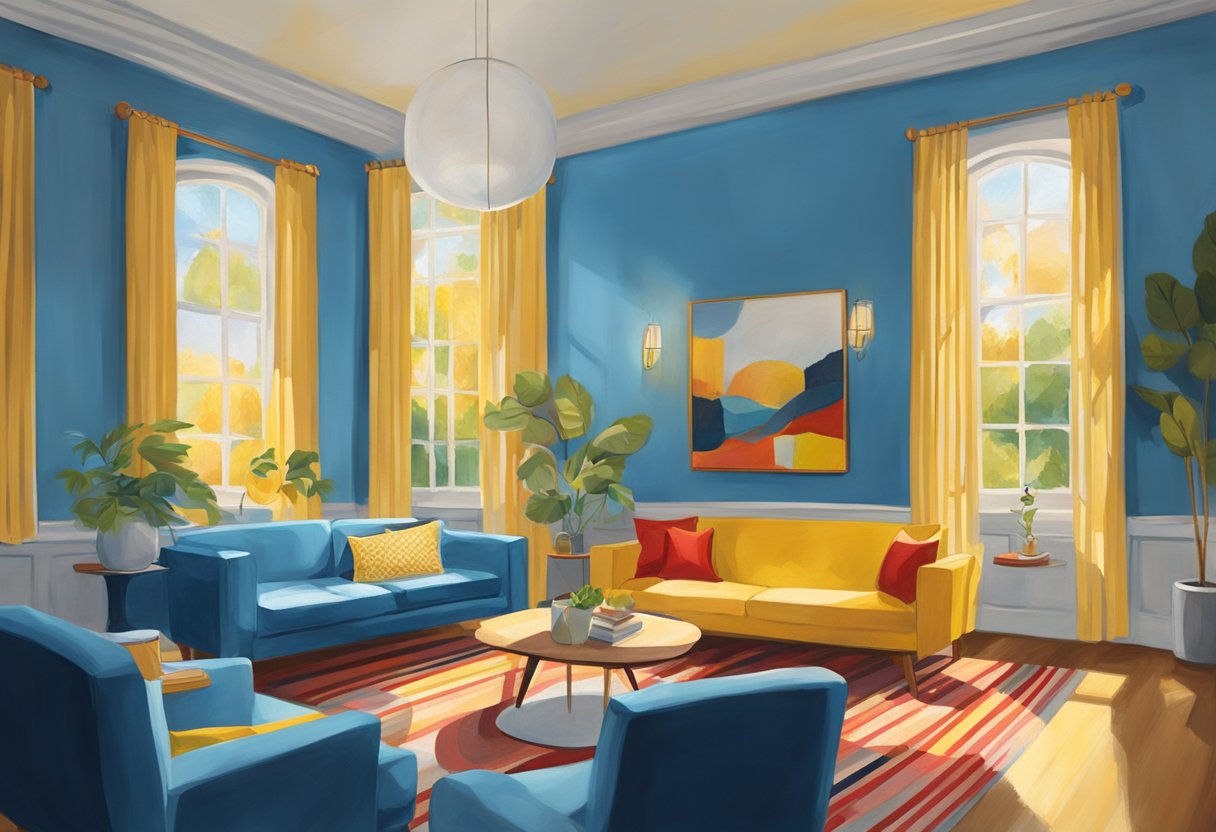
For a more subtle and harmonious approach, artists can experiment with a triadic combination of purple, green, and orange. These secondary colors offer a softer and less contrasting palette, resulting in an elegant and balanced composition. This combination works well for artworks that evoke a sense of tranquility and harmony.
Example 3: Vibrant and Playful
By combining vibrant colors such as pink, turquoise, and yellow-green in a triadic scheme, artists can create artworks that exude energy and playfulness. This combination is perfect for artwork aimed at capturing the attention and imagination of viewers, making it ideal for vibrant and energetic pieces.
These examples are just a glimpse into the countless possibilities offered by the triadic color scheme. Artists are encouraged to experiment with their own unique combinations and explore the impact of different triadic palettes on their artwork.
By understanding and harnessing the power of triadic color combinations, artists can create visually striking and captivating pieces that truly stand out. So go ahead, unleash your creativity, and let the triadic painting color scheme guide you towards vibrant and breathtaking artworks.
Incorporating Triadic Color Scheme in Different Art Mediums
When it comes to creating vibrant and visually striking artwork, the triadic painting color scheme offers endless possibilities. But how can you apply this scheme to different art mediums? Whether you prefer acrylics, oils, watercolors, or digital art, there are tips and considerations that can help you master the triadic color combination in any medium.
1. Acrylics:
Acrylic paint is known for its versatility and fast-drying properties, making it a popular choice among artists. To incorporate the triadic color scheme in your acrylic paintings, start by selecting three colors that form a triad on the color wheel. Experiment with different color combinations and proportions to achieve harmonious compositions. Consider layering and blending techniques to create depth and visual interest.
2. Oils:
Oils offer a rich and lustrous finish, allowing for smooth blending and subtle color transitions. When working with oils, it’s important to consider the extended drying time. Begin by choosing your triadic color combination and sketching out your composition. Build layers of colors, gradually adding depth and dimension. Take advantage of oil mediums and glazing techniques to create a luminous effect.
3. Watercolors:
Watercolors are known for their translucent and delicate appearance. To incorporate the triadic color scheme in watercolor paintings, start with a light wash of one of the primary colors in your triad. Layer additional washes of the other two colors, allowing them to blend and bleed into each other. Experiment with wet-on-wet and wet-on-dry techniques to create interesting textures and gradients.
4. Digital Art:
Digital art provides endless possibilities for exploring the triadic color scheme. Use digital painting software or graphic design tools to select your triadic colors and create a digital canvas. Experiment with different brushes, layers, and blending modes to achieve the desired effects. Take advantage of the ability to easily adjust and refine colors until you achieve the perfect balance.
Remember, no matter which art medium you choose, understanding color theory and the principles of the triadic color scheme is essential. Experimentation and practice will help you develop a strong sense of color combinations and their effects in your artwork. So go ahead, embrace the vibrant world of triadic color schemes and let your creativity shine!
Case Studies of Triadic Painting color schemes in Famous Artworks
In the realm of art, masterpieces come alive through the harmonious interplay of colors. Understanding how renowned artists have employed the triadic painting color scheme can provide invaluable insights and inspiration for aspiring creators. By analyzing famous artworks, we can delve into the captivating world of color combinations and their profound impact on the overall composition and mood.
1. Vincent van Gogh’s “Starry Night”
Van Gogh’s iconic masterpiece “Starry Night” showcases his mastery of the triadic painting color scheme. The warm, vibrant yellow of the stars contrasts beautifully with the deep blue night sky, while shades of green and purple in the landscape create a sense of depth and movement. This exquisite use of color harmonies evokes a dreamlike and emotional experience for the viewer.
2. Henri Matisse’s “The Dance”
“The Dance” by Matisse is a testament to the power of triadic color combinations. The primary colors of red, yellow, and blue take center stage, radiating energy and vitality. Matisse’s bold exploration of color intensifies the dynamic nature of the painting, inviting viewers to immerse themselves in the joyous celebration depicted.
3. Pablo Picasso’s “Les Demoiselles d’Avignon”
Picasso’s groundbreaking artwork, “Les Demoiselles d’Avignon,” pushes the boundaries of traditional color schemes. Through the use of triadic color combinations, such as red, blue, and green, Picasso disrupts conventional norms and creates a visual tension that reflects the fragmented and complex nature of the subject matter. This daring approach revolutionized modern art.
4. Wassily Kandinsky’s “Composition VIII”
Kandinsky’s abstract masterpiece, “Composition VIII,” exemplifies the power of triadic color harmonies to evoke emotional responses. Rich hues of blue, yellow, and red dance across the canvas, creating a vibrant symphony of interconnected shapes and lines. Kandinsky’s masterful use of color combinations elicits a sense of movement and visual harmony.
These case studies of famous artworks offer a glimpse into the immense possibilities and expressive potential of the triadic painting color scheme. By studying the successful integration of color combinations in these renowned pieces, artists can gain a deeper understanding of the strategic use of triadic colors to create visually captivating and emotionally resonant artwork.
Tips for Mastering Triadic Painting Color Scheme
Mastering the triadic painting color scheme requires a solid understanding of color theory and thoughtful selection of color combinations. Here are some practical tips and techniques to help you create vibrant and harmonious artworks:
1. Study Color Theory
To effectively use the triadic painting color scheme, familiarize yourself with the fundamental principles of color theory. Understand the relationships between primary and secondary colors, and how they interact to create harmonious compositions.
2. Experiment with Color Combinations
Don’t be afraid to explore different color combinations within the triadic scheme. Start by selecting three colors that are equidistant from each other on the color wheel. Play around with varying intensities and hues to discover captivating combinations that make your artwork stand out.
3. Consider Color Temperature
Color temperature plays a crucial role in the overall mood and atmosphere of your artwork. Warm colors like red, orange, and yellow evoke a sense of energy and vibrancy, while cool colors like blue, green, and purple create a more calming and serene ambiance. Balance warm and cool tones within your triadic color palette to achieve the desired emotional impact.
4. Pay Attention to Color Value
Color value refers to the lightness or darkness of a color. Utilize a range of values within your triadic color scheme to create depth and contrast in your artwork. Experiment with lighter and darker shades of your chosen colors to add visual interest and enhance the overall composition.
5. Use Neutrals Wisely
Neutrals such as black, white, and gray can help balance and unify the colors in your triadic palette. Consider incorporating them strategically in your artwork to provide a visual anchor and prevent overwhelming the viewer with too many vibrant colors.
“The triadic painting color scheme offers endless possibilities for creating dynamic and visually captivating artwork.” – Renowned artist, Jane Michaels
6. Think Beyond Traditional Paints
While conventional paints like acrylics and oils are popular choices for triadic painting, don’t limit yourself to these mediums. Explore other art forms such as digital art or mixed media to experiment with the triadic color scheme. Each medium offers its own unique opportunities for artistic expression.
7. Seek Inspiration from Established Artists
Study the works of famous artists who have successfully employed the triadic painting color scheme. Analyze their color choices, composition techniques, and the overall impact achieved. This can provide valuable insights and inspiration for your own artwork.
| Tips for Mastering Triadic Painting Color Scheme | Description |
|---|---|
| Study Color Theory | Familiarize yourself with the principles of color theory to understand how different colors interact. |
| Experiment with Color Combinations | Try out various combinations within the triadic scheme to find visually appealing blends. |
| Consider Color Temperature | Utilize warm and cool tones to evoke specific emotions and establish the desired atmosphere. |
| Pay Attention to Color Value | Create depth and contrast by incorporating a range of lightness and darkness in your artwork. |
| Use Neutrals Wisely | Balance and unify your colors by strategically incorporating neutral shades. |
| Think Beyond Traditional Paints | Explore different art mediums to experiment with triadic color schemes. |
| Seek Inspiration from Established Artists | Study the works of renowned artists and analyze their use of triadic color palettes. |
By following these tips and techniques, you can enhance your understanding and mastery of the triadic painting color scheme. Embrace the vibrant possibilities this scheme offers and let your creativity flourish.
Conclusion
Throughout this article, we have explored the fascinating world of the triadic painting color scheme and its significance in creating vibrant and harmonious artwork. By understanding the principles of color theory and exploring the color wheel, artists can unlock a myriad of possibilities in their compositions.
Through the use of complementary colors and strategic contrast, the triadic color scheme offers a dynamic and visually appealing palette. Whether working with acrylics, oils, watercolors, or digital art, artists can apply these principles to create stunning effects in their chosen medium.
By examining famous artworks that have successfully utilized the triadic color scheme, we have gained valuable insights into how color choices impact an artwork’s overall composition and mood. The triadic painting color scheme is a powerful tool for artists looking to create visual impact and evoke emotion in their work.
In conclusion, mastering the triadic painting color scheme allows artists to achieve a harmonious balance of vibrant colors in their compositions. By understanding the principles of color harmony and experimenting with different combinations, artists can bring their artwork to life with energy and visual interest. Embrace the power of the triadic color scheme and watch your creations come alive with vibrant hues and captivating compositions.