Unveil Painting Color Psychology Secrets
Did you know that the colors artists choose in their paintings can have a profound impact on our emotions and perception? The world of painting color psychology offers a fascinating journey into understanding how artists use colors to evoke specific feelings and convey powerful messages. From the principles of color theory in painting to the psychological effects of colors, this article will explore the secrets behind the art of using colors effectively.
Psychological Effects of Colors in Art
Colors have a profound impact on our emotions and can evoke powerful psychological responses. In the world of art, artists strategically harness these psychological effects of colors to convey deeper meanings and messages in their work. By understanding color symbolism and the associations that different colors have, artists can create artwork that elicits specific emotions from viewers.
Color symbolism in art plays a crucial role in conveying subliminal messages and evoking subconscious responses. Each color carries its own symbolism and associations, which vary across different cultures and contexts. For example, red is often associated with love, passion, and intensity, while blue is associated with calmness, tranquility, and stability. By using these colors intentionally, artists can communicate these emotions and concepts without explicitly stating them.
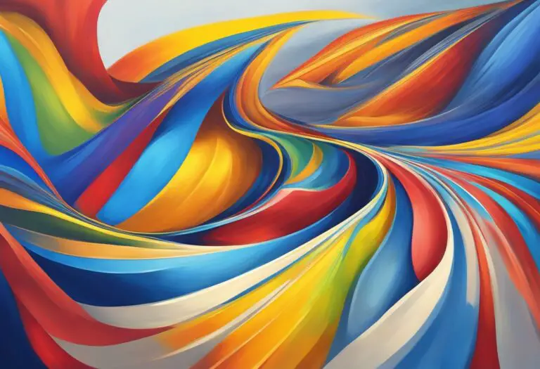
Artists also understand that colors have the power to influence our moods and emotions. Warm colors such as red, orange, and yellow tend to create a sense of energy and excitement. On the other hand, cool colors like blue and green have a calming and soothing effect. By skillfully selecting and combining these colors, artists can manipulate the mood and atmosphere of their artwork, creating a specific emotional experience for the viewer.
Furthermore, colors can be used to create contrast and emphasis within a piece of art. Bold and vibrant colors can draw the viewer’s attention to specific elements or focal points, while muted or neutral colors can create a sense of harmony and balance. The skillful use of color contrast and emphasis guides the viewer’s gaze and enhances the overall visual impact of the artwork.
When it comes to the psychological effects of colors in art, cultural and personal associations with colors also play a significant role. Different cultures attribute different meanings to colors, which can influence how viewers interpret and respond to artwork. Additionally, personal experiences and memories can shape an individual’s emotional response to specific colors.
In conclusion, the psychological effects of colors in art are a powerful tool that artists utilize to convey emotions, messages, and deeper meanings. By understanding color symbolism and the impact of different colors on our emotions, artists can create artwork that resonates with viewers on a profound level.
“Colors, like features, follow the changes of the emotions.” – Pablo Picasso
| Color | Symbolism |
|---|---|
| Red | Love, passion, intensity |
| Blue | Calmness, tranquility, stability |
| Yellow | Optimism, happiness, energy |
| Green | Nature, growth, harmony |
| Orange | Creativity, enthusiasm, warmth |
Impact of Colors on Mood in Paintings

Colors have a profound impact on the mood and atmosphere of a painting. Artists understand that different colors can evoke specific emotional responses from viewers, such as calmness, excitement, or serenity. By strategically selecting and using color palettes, artists can enhance the overall impact and convey the intended message of their artwork.
Color psychology for artists is the study of how colors influence human emotions and behaviors. It explores the psychological responses elicited by different colors and how they can create a particular mood or atmosphere within a painting. This understanding allows artists to effectively communicate their artistic vision and connect with viewers on an emotional level.
Let’s explore some of the psychological effects that various colors can have in paintings:
- Red: Often associated with passion, energy, and intensity, red can evoke strong emotions and create a sense of excitement or urgency in a painting.
- Blue: A calming and serene color, blue can evoke feelings of tranquility, stability, and depth. It is often used to portray a sense of peace or evoke a reflective mood.
- Yellow: Bright and vibrant, yellow is associated with happiness, warmth, and optimism. It can create a sense of joy and create a visually uplifting experience for viewers.
- Green: Symbolizing nature, growth, and harmony, green can create a soothing and refreshing atmosphere. It is often used to create a sense of balance and tranquility in paintings.
- Purple: Representing royalty, luxury, and spirituality, purple can convey a sense of mystery, intrigue, and depth. It is often used to create an air of sophistication or evoke a sense of magic.
By understanding the impact of colors on mood in paintings, artists can strategically use color palettes to create the desired emotional response from viewers. Whether it’s through the use of warm colors to convey energy and passion or cool colors to evoke a sense of calmness and tranquility, color choices play a crucial role in the overall impact and message of a painting.
Significance of Color Choices in Art
Color choices in art hold immense significance in shaping the overall meaning and impact of a piece. Artists understand that colors have the power to evoke emotions, convey messages, and create a visual experience that resonates with the viewer.
“Color choices in art are like words in a story. They have the ability to communicate ideas, emotions, and narratives with great depth and precision.” – Renowned artist, Anna Thompson
When selecting colors for their work, artists take into consideration various factors, including color symbolism, cultural associations, and personal interpretations. Each color carries its own psychological and cultural meanings, and artists strategically tap into these associations to enhance the conceptual and emotional depth of their artwork.
Color symbolism is the use of specific colors to represent abstract ideas, concepts, or emotions. For example, red often symbolizes passion or intensity, while blue can embody calmness or serenity. By integrating color symbolism into their work, artists are able to convey complex notions and evoke specific responses from the viewer.
Furthermore, understanding color psychology can inform painting techniques and enhance an artist’s ability to effectively communicate through color. Color psychology explores how colors influence human perception and emotions. By utilizing this knowledge, artists can use color combinations, contrasts, and harmonies to evoke particular moods and create impactful visual experiences.
One technique that artists employ is the use of contrasting colors to create visual interest and draw attention to specific elements within a composition. By juxtaposing complementary colors, which are located opposite each other on the color wheel, artists can create dynamic and attention-grabbing effects. The contrast between warm and cool colors, such as red and blue, can convey a sense of tension or balance within a painting.
“Understanding color psychology allows artists to harness the emotional potential of color, allowing their work to speak to viewers on a deeper, more visceral level.” – Art critic, Samuel Rodriguez
Moreover, artists often consider the cultural associations of certain colors when selecting their palette. Colors can have different meanings and connotations across various cultures, and artists may choose to embrace or subvert these associations in their work. By doing so, they can engage in a dialogue with cultural norms and challenge preconceived notions about color.
To further illustrate the significance of color choices in art, let’s take a look at the following examples:
| Color Choice | Meaning/Association | Artistic Effect |
|---|---|---|
| Yellow | Optimism, happiness | Elicits a cheerful and positive response |
| Black | Mystery, elegance | Creates a sense of depth and intrigue |
| Green | Nature, growth | Evokes a sense of tranquility and harmony |
| Orange | Energy, enthusiasm | Creates a vibrant and dynamic atmosphere |
By consciously selecting colors that align with their artistic intentions, artists can amplify the emotional impact of their work and create a more nuanced and engaging experience for the viewer.
The significance of color choices in art cannot be understated. By considering color symbolism, cultural associations, and leveraging color psychology, artists can create visually striking and emotionally resonant artwork that captivates and communicates effectively.
Painting with Emotional Color Palettes
In the world of art, colors have the power to evoke emotions and create a visual language that goes beyond words. Artists understand the psychological impact of colors and use them strategically to communicate their intended messages. One powerful technique artists employ is painting with emotional color palettes. By selecting specific combinations of colors, they create a visual experience that resonates with viewers on an emotional level.
Emotional color palettes consist of carefully chosen colors that work together harmoniously to create a specific mood or atmosphere in a painting. These palettes can vary depending on the artist’s intention and the emotions they want to evoke. For example, warm colors like reds, yellows, and oranges are often associated with energy, passion, and excitement, while cool colors like blues and greens are associated with calmness, tranquility, and serenity.
By understanding color psychology, artists can harness the power of emotional color palettes to amplify the impact of their artwork. They carefully consider how colors interact with each other and the overall composition of the painting. By using contrasting or complementary colors, artists can create visual tension or harmony, further enhancing the emotional impact. They may also use color accents or focal points to draw the viewer’s attention and intensify the desired emotional response.
Painting with emotional color palettes is not only about the individual colors chosen but also about their relationships and the emotions they provoke when combined. Through experimentation and a deep understanding of color theory, artists can create visually captivating and emotionally engaging works of art. Whether it’s a vibrant and energetic palette or a soothing and peaceful one, emotional color palettes allow artists to convey their intended messages and touch the hearts of their audience.
The Power of Color Harmony
In the world of painting, color harmony plays a crucial role in creating visually compelling and emotionally impactful artwork. By understanding the principles of color theory and employing various color harmonies, artists can evoke specific emotions from the viewer and enhance the overall visual experience.
One of the key aspects of color harmony is the use of complementary colors. Complementary colors are hues that are opposite each other on the color wheel, such as blue and orange or red and green. When used together, these colors create a sense of balance and visual tension, making the artwork more dynamic and engaging.
Another color harmony technique is the use of analogous colors, which are hues that are adjacent to each other on the color wheel. Artists often use these colors to create a harmonious and soothing effect in their paintings. For example, a landscape painting with a palette of different shades of green and yellow can create a serene and peaceful atmosphere.
Monochromatic color schemes, on the other hand, involve using different shades, tints, and tones of a single color. This creates a sense of unity and coherence in the artwork, allowing the viewer to focus on the subtle variations within the chosen color. Monochromatic color schemes can evoke different emotions depending on the selected color, such as calmness with different shades of blue or passion with different shades of red.
By carefully considering and employing these color harmonies, artists can enhance the overall visual impact of their artwork and evoke specific emotions from the viewer. The strategic use of complementary, analogous, or monochromatic color schemes allows artists to create a sense of balance, harmony, or tension in their paintings, amplifying the intended message and eliciting a deeper emotional response.
The Psychological Effects of Color Harmony
Color harmony not only creates visual appeal but also affects the psychological perception of the viewer. When colors are harmoniously used in a painting, they can evoke emotions such as joy, tranquility, or excitement. This is because the brain perceives color relationships and harmonious combinations as visually pleasing and aesthetically balanced.
For example, a painting that uses complementary colors like blue and orange can create a powerful contrast and evoke a sense of energy and vibrancy. On the other hand, an artwork with an analogous color scheme, like different shades of purple, can create a calming and soothing effect.
Understanding the psychological effects of color harmony allows artists to intentionally create specific atmospheres and elicit emotional responses from the viewer. By utilizing these color relationships, artists can effectively communicate their intended message and establish a deeper connection between their artwork and the audience.
| Color Harmony Technique | Description | Example |
|---|---|---|
| Complementary Colors | Colors that are opposite each other on the color wheel | A painting that uses blue and orange to create visual tension |
| Analogous Colors | Colors that are adjacent to each other on the color wheel | A landscape painting with shades of green and yellow for a harmonious effect |
| Monochromatic Color Scheme | Various shades, tints, and tones of a single color | A painting with different shades of blue to create a sense of unity |
Exploring Cultural and Symbolic Color Meanings
In the world of art, colors hold significant cultural and symbolic meanings that add depth and expression to the artwork. Artists skillfully use colors to convey cultural context, evoke specific emotions, and communicate symbolic representations. Understanding the significance of color choices in art allows artists to create visually compelling and thought-provoking pieces.
Colors have the power to convey cultural context and societal associations. Different cultures attribute distinct meanings to colors. For example, in Western cultures, the color white often symbolizes purity and innocence, while in some Asian cultures, it represents mourning and death. By incorporating these cultural color meanings into their artwork, artists can effectively communicate messages that resonate with a specific audience or cultural background.
“Colors are like words. They carry meaning and evoke emotions. By understanding their symbolic significance, artists can create powerful narratives with their artwork.”
In addition to cultural context, colors can evoke specific emotions in viewers. Warm colors such as red and orange can ignite passion and energy, while cool colors like blue and green can create a sense of calm and serenity. Artists strategically select colors to elicit emotional responses from their audience, heightening the impact and connection with their artwork.
Colors also carry symbolic representations in various art movements. For instance, in Renaissance art, the color gold represented divine divinity, and it was often used to depict religious figures. Symbolic color choices enable artists to convey deeper meanings and messages in their artwork, allowing viewers to explore themes and concepts beyond the surface visual interpretation.
Bringing Symbolic Colors to Life: Examples from Art History
Throughout art history, many renowned artists have harnessed the power of color symbolism to create masterpieces that captivate and intrigue viewers. One notable example is Vincent van Gogh’s use of vibrant yellow in his famous painting “The Starry Night.” The color yellow is associated with positivity and happiness, adding an uplifting and dreamlike quality to the artwork.
Another example is Pablo Picasso’s use of blue during his Blue Period. The color blue symbolized sadness and melancholy, reflecting the artist’s personal struggles and emotions during that time. Through the use of color, Picasso conveyed a profound sense of introspection and emotional depth in his artwork.
By exploring cultural and symbolic color meanings, artists can tap into a rich reservoir of visual language and enhance the impact of their art. With each stroke of paint, they can create an immersive experience that sparks emotions, provokes thoughts, and fosters connections between the artwork and the viewer.
Mastering Color Techniques in Painting
When it comes to creating captivating and impactful paintings, understanding color psychology and employing color theory in your art can make all the difference. In this section, we will explore practical techniques for incorporating color psychology into your painting process. By mastering these color techniques, you will be able to effectively communicate your intended messages and evoke the desired emotional responses from your viewers.
Color Temperature
One essential aspect of color psychology in painting techniques is understanding color temperature. Colors can be categorized as warm or cool based on their associations with temperature. Warm colors, such as red, orange, and yellow, can evoke feelings of energy, excitement, and passion. On the other hand, cool colors like blue, green, and purple can create a sense of calmness, tranquility, and serenity. By strategically using warm or cool colors in your paintings, you can influence the emotional response of your viewers and set the mood for your artwork.
Value and Saturation
The values and saturation of colors in your painting also play a crucial role in conveying depth, contrast, and visual interest. Value refers to the lightness or darkness of a color, while saturation pertains to the intensity or purity of a color. By manipulating the values and saturation levels of different colors, you can create a sense of depth and dimension in your artwork. Emphasizing contrasting values can draw attention to specific areas of your painting, while playing with saturation levels can evoke different emotions and moods.
Contrast and Focal Points
Another important technique in utilizing color psychology in painting is the effective use of contrast and focal points. Contrast refers to the juxtaposition of different colors to create visual interest and make certain elements stand out. By incorporating contrasting colors in your composition, you can add dynamism and create focal points that capture the viewer’s attention. Consider using complementary colors, which are located opposite each other on the color wheel, or experimenting with color combinations that create a strong contrast to highlight specific areas or subjects in your painting.
Color Harmony
Creating color harmony in your artwork is key to achieving a visually pleasing and well-balanced composition. Color harmony involves selecting colors that complement each other and work together harmoniously. There are different types of color harmonies, such as complementary, analogous, and monochromatic. Complementary color schemes use colors that are opposite each other on the color wheel and can create a vibrant and energetic effect. Analogous color schemes combine colors that are adjacent to each other on the color wheel and can produce a more harmonious and subtle result. Monochromatic color schemes focus on variations of a single color, creating a sense of unity and tranquility. By understanding and applying these color harmonies, you can enhance the overall visual impact of your painting.
By integrating color psychology in your painting techniques and mastering these concepts, you can elevate your artistic skills and create impactful and emotionally resonant artwork. Color temperature, value, saturation, contrast, and color harmony all contribute to the visual language of your paintings, allowing you to communicate powerful and evocative messages through the colors you choose. Experiment with these techniques and observe how they can transform your artwork and create a deeper connection with your audience.
Conclusion
In conclusion, the world of painting color psychology offers fascinating insights into how artists harness the power of colors to elicit emotions and convey profound messages through their artwork. By understanding the psychological effects of colors, artists can make deliberate choices that enhance the meaning and impact of their paintings. Whether it is through emotional color palettes, color harmony, or an understanding of cultural and symbolic color meanings, color psychology plays a vital role in the artistic process.