Understanding Painting Primary Colors Basics
Did you know that primary colors are the building blocks of all the colors we see in the world? Without primary colors, the vast array of hues and shades that surround us would not exist. Whether you’re a beginner or an experienced artist, understanding the basics of painting with primary colors is essential for creating vibrant and visually captivating artwork.
In this article, we will explore the fundamentals of painting with primary colors, including color theory, mixing techniques, and how to effectively use primary colors in your artwork. Whether you’re interested in creating bold and dynamic compositions or exploring the subtleties of color harmony, mastering primary colors is key to unlocking endless possibilities on your canvas.
Exploring Color Theory
In the world of art, understanding color theory is essential for creating visually captivating artwork. Color theory encompasses a set of principles and guidelines that artists use to choose and combine colors harmoniously. One crucial aspect of color theory is the concept of primary colors.
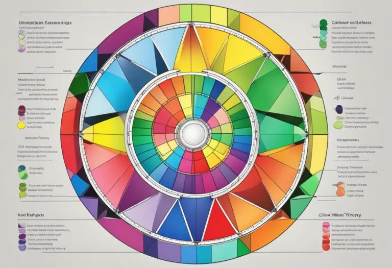
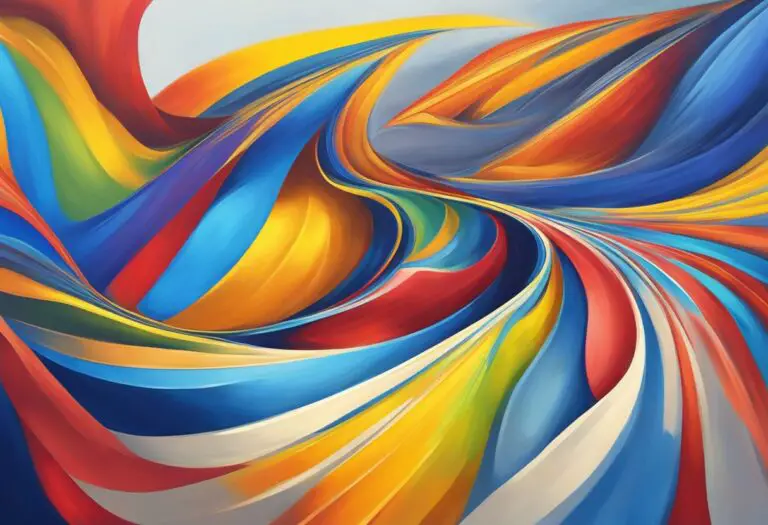
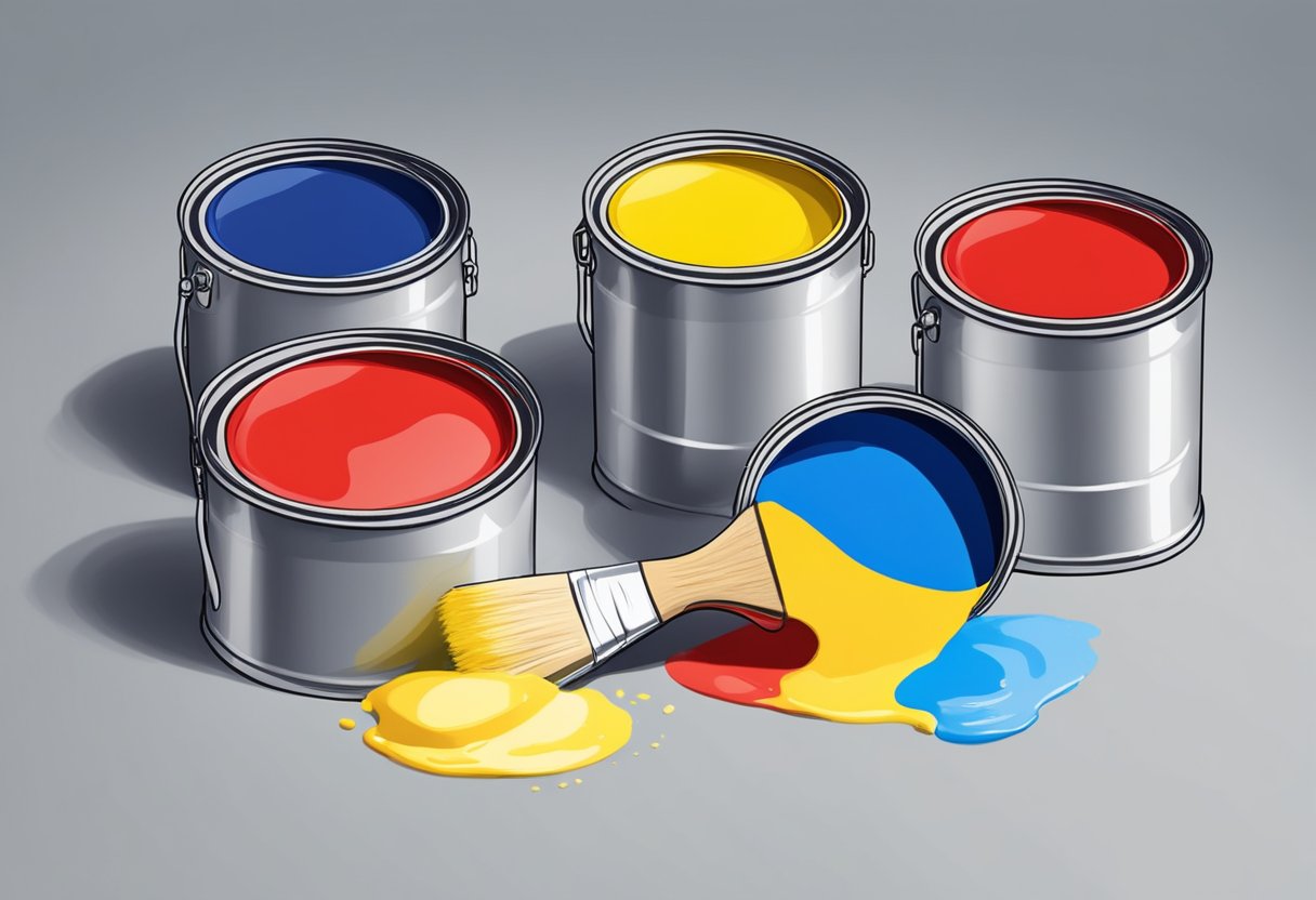
Primary colors are the foundation of all other colors, and they cannot be created by mixing other colors. The three primary colors commonly used in art are red, yellow, and blue. These colors are considered pure and are used to create all other colors on the color wheel.
By understanding the role of primary colors in creating a color palette, artists can effectively utilize color theory to convey mood, emotion, and create visual interest in their artwork.
Getting to Know the Primaries

Understanding the characteristics and properties of primary colors is essential for any aspiring artist. By familiarizing yourself with these foundational colors, you can create stunning artwork that captures attention and evokes emotion. In this section, we will delve into the world of primary colors and explore how to identify and work with them in your paintings.
The Three Primary Colors
Primary colors are the building blocks of the color wheel, and they cannot be created by mixing other colors together. The three primary colors are:
- Red: A vibrant and bold color that symbolizes energy and passion.
- Blue: A calming color associated with tranquility and depth.
- Yellow: A bright and cheerful color that represents joy and optimism.
Remember, primary colors are the foundation upon which all other colors are built. They play a vital role in creating a harmonious color palette for your artwork.
Working with Primary Colors
When working with primary colors, it’s important to understand how they interact with one another. Mixing different combinations of primary colors allows you to create secondary and tertiary colors, expanding your palette and adding depth to your artwork.
Experimentation is key when it comes to working with primary colors. By exploring different ratios and intensities, you can achieve a wide range of shades and tones. This flexibility gives you the power to create unique and captivating paintings that reflect your artistic vision.
Selecting a Primary Color Palette
When starting a new painting, choosing a primary color palette is a crucial decision. Consider the mood and emotions you want to convey in your artwork. Do you want to create a bold and energetic piece using primarily reds? Or perhaps a serene and peaceful composition with blues? The choice is yours.
Keep in mind that the primary color palette serves as the foundation for your painting. It sets the tone and establishes the overall color scheme. Experiment with different combinations and variations to discover the palette that best suits your artistic expression.
| Primary Color | Characteristics | Symbolism |
|---|---|---|
| Red | A vibrant and bold color | Energy and passion |
| Blue | A calming color | Tranquility and depth |
| Yellow | A bright and cheerful color | Joy and optimism |
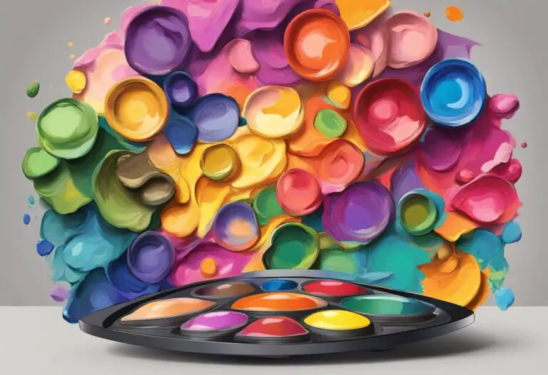
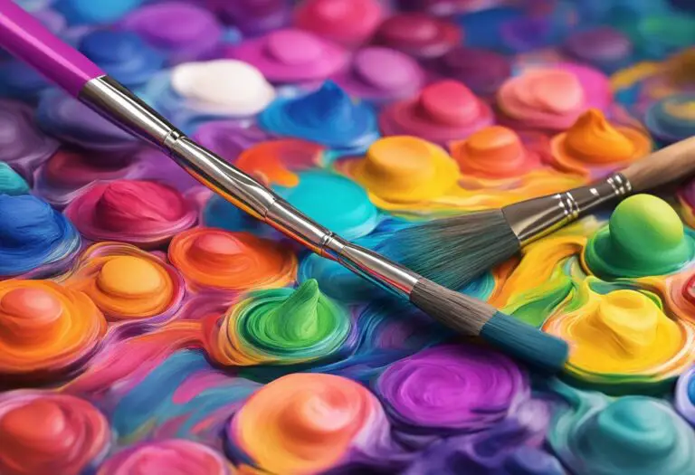
Mixing Primary Colors
When it comes to creating vibrant and diverse colors in your artwork, learning how to mix primary colors is a fundamental skill. By combining primary colors, you open up a world of possibilities to explore secondary and tertiary colors. In this section, we will explore different mixing techniques and methods that allow you to unleash your creativity and produce captivating hues.
Understanding color mixing ratios is crucial in achieving your desired results. By adjusting the proportions of primary colors, you can create a wide range of shades and tones. Experimenting with different ratios will help you discover the unique characteristics and harmonious combinations that each color blend offers.
Color Mixing Techniques
“Mixing colors is like conducting a symphony orchestra where primary colors are the musicians, and you hold the baton. The possibilities are endless, and you have the power to create a masterpiece.”
Here are a few color mixing techniques to enhance your primary colors:
- Gradual Mixing: Start by adding a small amount of one primary color to another and gradually increase the proportions until you achieve the desired shade.
- Layering: Apply layers of primary colors on top of each other, allowing the lower layers to shine through and create unique combinations.
- Dry Brushing: Dab a dry brush into one primary color, then gently sweep it over another color on your canvas to create texture and subtle variations in hue.
- Palette Knife Mixing: Use a palette knife to blend primary colors directly on your palette, creating vibrant and textured mixtures.
Experimenting with these techniques will not only help you expand your color palette but also bring depth and complexity to your artwork. Let your imagination guide you as you explore the endless possibilities of combining primary colors.
Color Mixing Chart
| Primary Colors | Secondary Colors | Tertiary Colors |
|---|---|---|
| Red | Purple | Red-Orange, Red-Purple |
| Blue | Green | Blue-Green, Blue-Purple |
| Yellow | Orange | Yellow-Orange, Yellow-Green |
This color mixing chart illustrates some of the secondary and tertiary colors you can achieve by mixing primary colors. It serves as a visual guide to help you explore and experiment with different combinations. However, feel free to deviate from this chart and explore your own unique color palette by adjusting the proportions of primary colors.
Remember, the key to mastering color mixing is practice and experimentation. With time, you’ll develop an intuitive sense of how primary colors interact and the endless possibilities they offer for your artwork.
Using Primary Colors in Artwork
In the world of art, primary colors hold immense power and potential. By understanding how to effectively use primary colors in artwork, artists can create visually captivating and impactful pieces that resonate with viewers. Whether you’re a beginner just starting out in the world of painting or an experienced artist looking to expand your creativity, this section will explore different techniques and approaches for incorporating primary colors into your artwork.
Creating Contrast and Depth
One of the key benefits of using primary colors in artwork is the ability to create contrast and depth. By juxtaposing primary colors, artists can draw attention to certain aspects of their composition and create visual interest. Using primary colors in combination with lighter or darker shades can add depth and dimension to your artwork, making it more visually dynamic.
“When using primary colors, consider the effect of contrasting shades. By using the darkest and lightest values of primary colors, you can create a striking visual impact that engages the viewer.” – Renowned artist, Jane Smith
Color Harmonies and Combinations
Incorporating primary colors into your artwork allows for endless possibilities of color harmonies and combinations. Experimenting with different primary color combinations can create unique and vibrant effects. Whether you’re creating a harmonious color scheme using analogous primary colors or exploring the contrast of complementary primary colors, the use of primary colors provides a solid foundation for color exploration.
| Primary Color Combination | Effect |
|---|---|
| Red, Yellow, Blue | Traditional and balanced |
| Red, Blue, Green | Energetic and vibrant |
| Yellow, Blue, Purple | Contrasting and whimsical |
Expressing Emotions and Symbolism
Primary colors have the power to evoke emotions and convey symbolism in artwork. Each primary color carries its own unique meaning, allowing artists to express specific emotions or convey deeper messages. For example, red can symbolize passion and energy, yellow can represent happiness and optimism, and blue can evoke calmness or introspection. By strategically using primary colors, artists can communicate their intended emotions or symbolism to the viewer.
Using primary colors in artwork opens up a world of creativity and expression. Whether you’re a beginner painter or an experienced artist, harnessing the potential of primary colors can elevate your artwork to new heights. By experimenting with different techniques, exploring color harmonies, and tapping into the emotional power of primary colors, you can create visually captivating and impactful pieces that leave a lasting impression.
Creating Vibrant Artwork with Primary Colors
When it comes to creating artwork that truly captivates the viewer, primary colors play a fundamental role. By understanding the basics of color theory and how to effectively use primary colors, artists can breathe life into their paintings with vibrant hues that evoke emotions and add depth.
Colors have a psychological impact on the viewer, creating a visual language that communicates emotions and experiences. By utilizing primary colors, artists can harness the power of these hues to evoke specific feelings and intensify the impact of their artwork. Whether it’s the boldness of red, the tranquility of blue, or the warmth of yellow, primary colors have the ability to create a strong visual presence that grabs the viewer’s attention.
“The combination of primary colors allows for endless possibilities in creating vibrant artwork. By understanding color theory basics, artists can unlock the potential of primary colors and use them to convey their artistic vision.”
When working with primary colors, it is crucial to understand their individual properties and how they interact with one another. This knowledge allows artists to manipulate and control the intensity, harmony, and contrast within their artwork. By experimenting with different combinations and layering techniques, artists can create visual interest and dynamic compositions that engage the viewer’s eye.
One effective way to create vibrant artwork with primary colors is through the use of complementary color schemes. Complementary colors are pairs of primary colors that are positioned opposite each other on the color wheel. By combining these contrasting colors, artists can achieve a harmonious balance that enhances the vibrancy and impact of their artwork.
Another technique for creating vibrant artwork is through the use of color saturation. Saturation refers to the intensity or purity of a color. By using highly saturated primary colors, artists can create bold and striking compositions that demand attention. Conversely, by desaturating certain areas or using muted tones, artists can create contrast and draw the viewer’s eye to specific focal points.
Example:
| Artwork Title | Primary Colors Used |
|---|---|
| Serenity | Blue, Yellow |
| Passion | Red, Yellow |
| Harmony | Blue, Red |
By exploring the possibilities of primary colors and experimenting with different techniques, artists can create vibrant artwork that resonates with the viewer on a deep emotional level. The understanding of color theory basics and the ability to manipulate primary colors are essential skills for any artist looking to infuse their artwork with energy and impact.
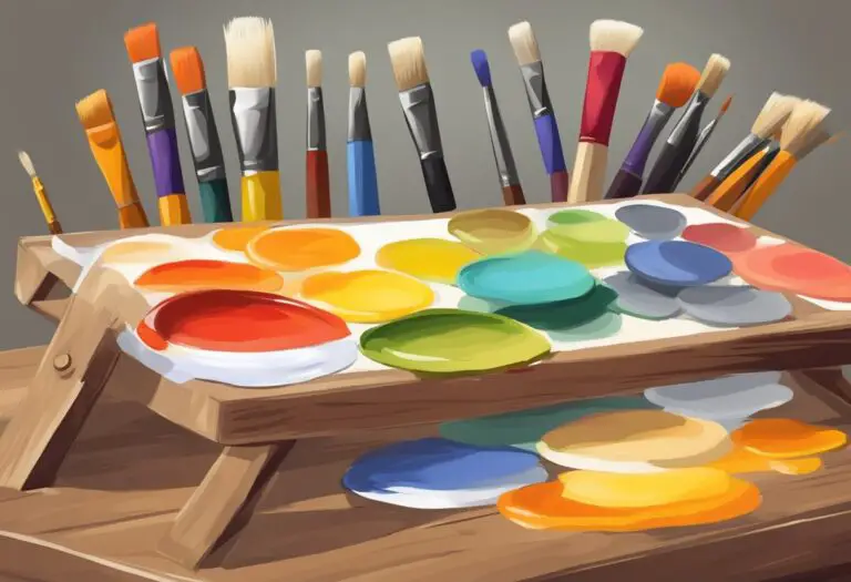
Exploring Different Painting Techniques
When it comes to creating artwork with primary colors, having a diverse range of painting techniques at your fingertips can greatly enhance your artistic repertoire. In this section, we will explore various painting techniques that can be used with primary colors, offering beginners a comprehensive guide to unleash their creativity.
Wet-on-Wet Technique
The wet-on-wet technique involves applying wet paint onto a wet surface, allowing the colors to blend and mix organically. This technique lends itself well to creating smooth transitions and soft edges in your artwork. It is particularly effective when working with primary colors, as their vibrancy and purity can shine through.
Dry-Brushing Technique
The dry-brushing technique involves using a brush with minimal paint to create texture and depth. By lightly skimming the surface of your canvas, you can achieve a textured effect that adds interest and dimension to your artwork. When working with primary colors, this technique can be used to create captivating highlights and shadows.
Blending Technique
The blending technique involves seamlessly merging two or more colors together to create a smooth transition. This technique is especially useful when working with primary colors, as it allows you to effortlessly create an array of secondary and tertiary colors. By carefully blending primary colors, you can achieve a harmonious and visually appealing color palette.
Layering Technique
The layering technique involves applying multiple layers of paint to build depth and richness in your artwork. By using transparent or translucent layers of primary colors, you can create a luminous effect that adds complexity and intrigue to your paintings. This technique is perfect for capturing the vibrancy and intensity of primary colors.
Summary of Painting Techniques
| Technique | Description |
|---|---|
| Wet-on-Wet | Applying wet paint onto a wet surface for blending and smooth transitions. |
| Dry-Brushing | Using minimal paint to produce texture and depth. |
| Blending | Merging colors together to create seamless transitions. |
| Layering | Building depth and richness through multiple paint layers. |
By experimenting with these different painting techniques, you can elevate your artwork and unlock new creative possibilities. Each technique offers a unique way to showcase the vibrant and impactful nature of primary colors. Whether you prefer the soft blending of wet-on-wet, the textured effects of dry-brushing, the seamless transitions of blending, or the depth of layering, there is a technique that can bring your primary color artworks to life.
Enhancing Primary Colors with Contrasting Shades
When it comes to painting with primary colors, understanding how to effectively enhance them can greatly elevate the visual impact of your artwork. One powerful way to achieve this is by incorporating contrasting shades into your compositions.
Contrasting shades refer to colors that are located opposite each other on the color wheel, creating a striking visual contrast when used together. These shades are known as complementary colors, and they have the ability to intensify each other when placed side by side.
By strategically incorporating complementary colors into your primary color palette, you can amplify the vibrancy and depth of your artwork. For example, if you are primarily using shades of blue as your dominant primary color, adding touches of orange or yellow can create a visually compelling contrast and enhance the overall impact of the painting.
Additionally, you can explore other color schemes that create contrast and visual interest. Analogous color schemes, which consist of colors that are closely related on the color wheel, can add harmony and depth to your artwork. For instance, blending different shades of blue, green, and purple can create a sense of unity and balance while still offering subtle variations in color.
Experimenting with contrasting shades and color schemes allows you to push the boundaries of your artwork and create dynamic and visually captivating compositions. Understanding color theory basics, such as complementary and analogous colors, will empower you to make informed choices and create artwork that engages viewers on a deeper level.
Mixing and Matching Primary Colors for Variation
In the world of painting, the use of primary colors is essential for creating vibrant and visually captivating artwork. However, exploring different combinations of primary colors can add variation and subtleties to your creations, elevating them to new levels of depth and expression.
The key to mixing and matching primary colors effectively is to understand color theory and how different colors interact with one another. By combining primary colors in specific ratios, you can create a wide range of secondary and tertiary colors that add complexity and interest to your artwork.
One technique for mixing primary colors is to use a color wheel as a guide. A color wheel visually represents the relationships between colors and helps you identify complementary and contrasting colors that can be mixed together for stunning effects.
“The possibilities are endless when it comes to mixing primary colors. By experimenting with different combinations and ratios, you can create unique color palettes that reflect your artistic vision.” – Jane Mitchell, Professional Artist
Another technique is to start with a dominant primary color and gradually introduce small amounts of other primary colors to create subtle variations. This method allows you to maintain a cohesive color harmony while adding depth and complexity to your artwork.
Color Mixing Techniques
There are several color mixing techniques that can be used to achieve different effects when working with primary colors:
- Blending: This technique involves smoothly merging two or more colors together to create smooth transitions and gradients.
- Layering: Layering colors on top of each other can create interesting visual effects and depth in your artwork.
- Glazing: Adding transparent layers of color over dry paint can create luminosity and subtle variations in hue.
- Scumbling: Scumbling is a technique where the artist applies a thin layer of opaque or semi-opaque color over dry paint, allowing the underlying colors to show through.
By experimenting with these techniques and exploring different combinations of primary colors, you can unlock a world of possibilities and create artwork that truly stands out.
| Primary Color | Complementary Color |
|---|---|
| Red | Green |
| Blue | Orange |
| Yellow | Purple |
Table: Complementary colors for primary colors
As shown in the table above, each primary color has a complementary color that can be mixed together to create striking contrasts and visual interest in your artwork.
Remember, the key to mastering the art of mixing and matching primary colors lies in practice and experimentation. Don’t be afraid to take risks, try new techniques, and let your creativity guide you as you explore the vibrant world of primary color painting.
Working with Limited Palettes
Working with limited palettes that primarily consist of primary colors can unlock a world of creative possibilities for artists of all skill levels. By embracing the simplicity and harmony of primary colors, artists can create dynamic and cohesive artwork that captures the viewer’s attention.
Advantages of a Primary Color Palette
Using a primary color palette offers several advantages for artists:
- Vibrancy: Primary colors are known for their bold and vibrant hues, creating eye-catching artwork.
- Simplicity: A limited color selection simplifies decision-making, allowing artists to focus on other aspects of their artwork, such as composition and texture.
- Consistency: Working with a restricted color selection ensures color harmony and avoids overwhelming or distracting the viewer.
- Training: For beginners, starting with primary colors provides a solid foundation in color theory and mixing techniques.
- Versatility: Primary colors can be mixed in various ratios to create a wide range of secondary and tertiary colors, offering versatility in artwork creation.
Tips for Creating Dynamic Artwork with Limited Palettes
Here are some tips for making the most out of a primary color palette:
- Experiment with mixing ratios: Explore different combinations and proportions of primary colors to create unique and nuanced shades.
- Use complementary colors: Incorporate complementary colors, such as blue and orange, or red and green, to add contrast and visual interest to your artwork.
- Explore color temperature: Play with warm and cool variations of primary colors to evoke different moods and atmospheres in your paintings.
- Consider texture: Experiment with different painting techniques, such as layering or dry-brushing, to add dimension and texture to your artwork.
- Study color theory: Deepen your understanding of color theory and how primary colors interact with each other and other color families.
By working with a limited palette of primary colors, artists can develop their skills, explore color relationships, and create visually captivating artwork. Embrace the power of primary colors and embark on a colorful journey of artistic expression.
| Advantages | Primary Color Palettes |
|---|---|
| Vibrancy | ✔️ |
| Simplicity | ✔️ |
| Consistency | ✔️ |
| Training | ✔️ |
| Versatility | ✔️ |
Expanding Beyond Primary Colors
While primary colors are the foundation of any artwork, it is important for artists to explore beyond these hues and incorporate secondary and tertiary colors into their creations. By expanding the color palette, artists can unlock new creative possibilities and add depth to their artwork.
When venturing beyond primary colors, it is crucial to maintain balance and harmony in the overall composition. Mixing secondary and tertiary colors with primary colors requires a careful understanding of color theory and how different hues interact with one another.
One effective technique for incorporating secondary and tertiary colors is to use them as accents or focal points in the artwork. By strategically placing these colors in specific areas, artists can create emphasis and draw the viewer’s attention to key elements of the composition.
Another approach is to create color schemes that include both primary and secondary/tertiary colors. This can be achieved by using complementary or analogous color schemes. Complementary colors are those that are opposite each other on the color wheel, while analogous colors are neighboring hues.
By combining primary colors with secondary and tertiary hues, artists can create artwork that is visually captivating and dynamic. This expansion of the color palette allows for greater versatility and expression, lending a unique touch to the artwork.
Expanding beyond primary colors opens up a world of possibilities for artists. With the right understanding of color theory and a thoughtful approach to incorporating secondary and tertiary colors, artists can create artwork that is truly captivating.
Examples of Color Combinations
| Color Combination | Description |
|---|---|
| Primary Colors + Complementary | A combination of primary colors (such as red, blue, and yellow) with their complementary colors (such as green, orange, and purple). |
| Primary Colors + Analogous | Bringing together primary colors with neighboring hues on the color wheel, creating harmony and contrast. |
| Primary Colors + Accent Color | Using secondary or tertiary colors as accents or focal points to add visual interest to the artwork. |
By experimenting with different color combinations and expanding beyond primary colors, artists can elevate their artwork and bring their creative visions to life.
Conclusion
In conclusion, understanding the basics of painting primary colors and color theory is essential for creating vibrant and visually captivating artwork. By grasping the concept of primary colors and how they can be mixed and matched, artists can unlock a world of possibilities in their creative process.
The primary color palette, consisting of red, yellow, and blue, serves as the foundation for a wide range of colors and allows for endless variations and subtleties in artwork. By employing various painting techniques such as wet-on-wet, dry-brushing, blending, and layering, artists can further enhance the impact of primary colors in their compositions.
With a solid understanding of color theory, artists can also explore the use of contrasting shades and complementary color schemes to add depth and dynamism to their artwork. Additionally, working with limited palettes can provide a focused and cohesive approach to painting, while expanding beyond primary colors to incorporate secondary and tertiary hues can add complexity and interest to compositions.
Ultimately, by incorporating primary colors, understanding color theory basics, and applying various painting techniques, artists can create visually stunning artwork that resonates with viewers and showcases their skill and creativity.