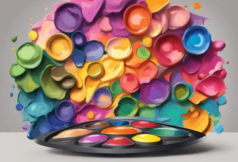
Understanding Painting Color Temperature
Did you know that the color temperature of a painting can dramatically impact its emotional impact and composition? From soothing cool hues to vibrant warm tones, the choice of colors in artworks holds immense power in conveying mood and atmosphere.
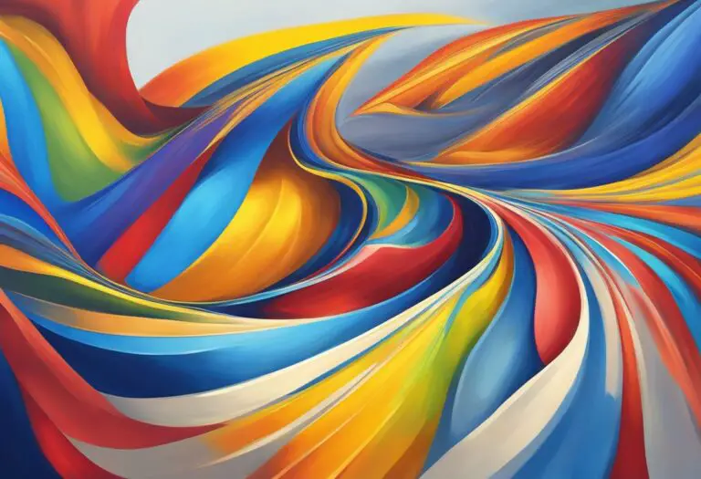
Color temperature in art refers to the perceived warmth or coolness of a color. Warm colors like red, orange, and yellow create a sense of energy and warmth, while cool colors like blue, green, and purple evoke calmness and tranquility.
In this article, we will explore the effects of warm and cool colors in painting and how artists can strategically utilize color temperature to enhance the mood and composition of their artworks. Whether you’re a seasoned painter or simply curious about the art world, understanding the intricacies of painting color temperature can unlock a world of creative possibilities.
What is Color Temperature in Art?
Color temperature is a fundamental concept in the world of art that refers to the perceived warmth or coolness of a color. It plays a crucial role in conveying emotions and setting the atmosphere in paintings. Understanding color temperature allows artists to effectively utilize warm and cool colors to evoke specific feelings and create visual impact.
The Difference Between Warm and Cool Colors
Warm colors, such as red, orange, and yellow, are associated with heat, energy, and passion. They have shorter wavelengths and stimulate a sense of warmth and intensity in artworks. Cool colors, on the other hand, like blue, green, and purple, are reminiscent of calmness, tranquility, and depth. With longer wavelengths, they create a soothing and serene ambiance in paintings.
Warm colors bring vibrancy and energy, while cool colors establish a sense of calm and depth.
By strategically incorporating warm and cool hues in their artworks, artists can effectively communicate different emotions and atmospheres. The interplay between these colors enables them to control the visual experience of the viewer, guiding their focus and evoking specific responses.
Whether it’s conveying the excitement of a bustling cityscape with warm oranges and reds or capturing the serenity of a tranquil landscape with cool blues and greens, understanding color temperature provides artists with a powerful tool to enhance the impact of their paintings.
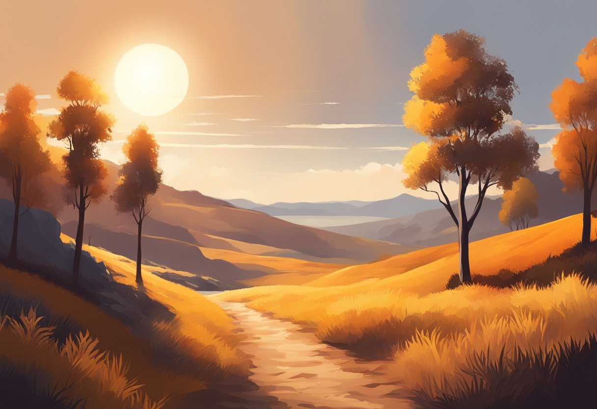
The Effects of Warm Colors in Painting
Warm colors play a vital role in painting, infusing artworks with energy, warmth, and vibrancy. Artists utilize warm hues such as red, orange, and yellow to evoke strong emotions and create a sense of liveliness in their compositions.
When warm colors are strategically incorporated into a painting, they have the power to grab the viewer’s attention and establish a focal point. For example, a bold red flower in a garden scene can instantly draw the eye and become the centerpiece of the artwork.
Warm colors also have the ability to create a sense of depth, particularly when used in contrast with cool colors. By employing warm hues in the foreground and gradually transitioning to cooler tones in the background, artists can add visual interest and make their compositions visually captivating.
Moreover, warm colors have the ability to convey warmth, sunlight, and positive energy. In landscapes, the golden hues of a sunset or the glowing oranges of autumn foliage can evoke a feeling of comfort and joy. In figurative paintings, artists often use warm colors to portray the warmth and tenderness of human emotions.
It is important to note that the intensity and saturation of warm colors can influence the overall mood of a painting. Bold and vibrant warm hues create a sense of excitement and dynamism, while softer and more muted warm tones can evoke a sense of tranquility and coziness.
“The use of warm colors in painting allows artists to create a visual experience that is both stimulating and emotionally impactful.”
To fully harness the effects of warm colors, artists can experiment with color schemes that predominantly feature warm hues. The monochromatic use of warm colors or complementary combinations with cool accents can result in striking and harmonious compositions.
Warm Colors in Famous Paintings
Throughout art history, many renowned artists have utilized warm colors to great effect in their paintings:
- Van Gogh’s “The Starry Night” features a prominent warm color palette of vibrant blues and golden yellows, creating a dynamic and otherworldly nocturnal scene.
- Matisse’s “The Dance” showcases warm reds and oranges in the lively figures, conveying a sense of energy, movement, and celebration.
- Monet’s “Water Lilies” series uses warm hues to capture the beauty and serenity of the water garden, infusing the paintings with a sense of tranquility and peace.
Warm Colors and Their Characteristics
| Color | Characteristic |
|---|---|
| Red | A color that signifies passion, strength, and intensity. |
| Orange | A color associated with warmth, enthusiasm, and creativity. |
| Yellow | A color that represents happiness, positivity, and optimism. |
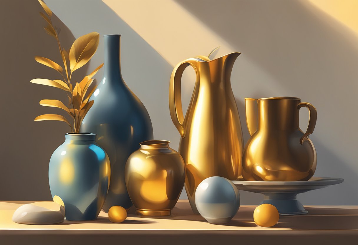
The Effects of Cool Colors in Painting
Cool colors, such as blue, green, and purple, have a distinct impact on paintings, evoking feelings of calmness, tranquility, and depth. When utilized effectively, these cool hues can add a sense of serenity and sophistication to artworks.
The color blue, often associated with the sky and water, creates a sense of stability and expansiveness in paintings. It can convey a feeling of tranquility and peacefulness, making it ideal for capturing serene landscapes or serene moments. Artists can use different shades of blue to add depth and dimension to their artworks, creating an illusion of distance or depth.
“The blue skies and gentle waves in Monet’s ‘Water Lilies’ series evoke a serene and tranquil atmosphere, transporting viewers to a peaceful oasis of nature.”
Green, symbolizing nature and growth, has a refreshing and soothing effect on paintings. It can evoke a sense of harmony, balance, and renewal. Artists can utilize different shades of green to represent lush landscapes, foliage, or even abstract concepts like growth and vitality.
“The vibrant greens and serene landscapes in Thomas Kinkade’s paintings create a peaceful ambiance, connecting viewers with the beauty of the natural world.”
Purple, a color often associated with royalty and spirituality, adds a touch of mystery and elegance to artworks. It can convey a sense of creativity, wisdom, and introspection. Artists can experiment with various shades of purple to create a sense of depth or to highlight specific elements within a composition.
“The rich purples and ethereal quality in Klimt’s ‘The Kiss’ give the painting a dreamlike and mystical atmosphere, capturing the essence of love and passion.”
The cool colors in painting can be complemented with warmer hues to create a contrast and enhance their impact. This interplay between warm and cool tones can heighten the visual interest and emotional resonance of the artwork.
By understanding the effects of cool colors and how they can influence the mood and composition of a painting, artists can effectively utilize color temperature to create captivating and emotionally engaging artworks.
Using Color Temperature for Mood and Composition
Color temperature is a powerful tool that artists can utilize to evoke specific moods, enhance composition, and establish focal points in their artworks. By strategically employing warm and cool colors, artists can create captivating and impactful pieces that resonate with viewers.
Creating Mood
The temperature of colors can greatly influence the emotional response elicited from a painting. Warm colors, such as reds, oranges, and yellows, tend to evoke feelings of energy, passion, and happiness. These hues are perfect for expressing warmth and vibrancy in a scene or conveying a sense of excitement and intensity.
On the other hand, cool colors like blues, greens, and purples create a calming and soothing effect. They can be used to represent tranquility, serenity, or a cool and distant atmosphere. Cool hues are often employed to depict landscapes, water scenes, or to create a sense of depth and space.
By carefully selecting and balancing warm and cool colors, artists can effectively convey different moods and emotions in their paintings, evoking a visceral response from the viewer.
Enhancing Composition
Color temperature can also be used to enhance the overall composition and visual impact of a painting. By employing warm colors as the focal point of a composition, artists can draw the viewer’s attention to specific areas or objects within the artwork. This creates a sense of emphasis and directs the viewer’s gaze to the intended point of interest.
Alternatively, cool colors can be utilized to create a sense of depth and recession. By placing cooler hues in the background or using them for distant elements, artists can enhance the illusion of spatial depth and create a more balanced composition.
In addition, artists can experiment with the juxtaposition of warm and cool colors to create dynamic and visually engaging compositions. The contrast between the two temperature extremes can add visual interest, energy, and a sense of movement to the artwork.
Establishing Focal Points
Color temperature can also be used to establish clear focal points within a painting. By using warm colors as the primary elements in a composition, artists can immediately draw the viewer’s attention and guide their gaze towards the intended focal point. This technique can be particularly effective in creating a strong visual impact and emphasizing important elements within the artwork.
Alternatively, artists can utilize cool colors as a way to create negative space around the focal point, further highlighting its importance. This technique can provide balance and breathing room within the composition, allowing the viewer to fully appreciate the subject of focus.
Whether it’s through the choice of warm or cool colors, artists can strategically employ color temperature to create mood, enhance composition, and establish focal points in their artworks. By harnessing the power of color, artists can bring their visions to life, evoking emotions and captivating viewers.
Techniques to Utilize Color Temperature in Painting
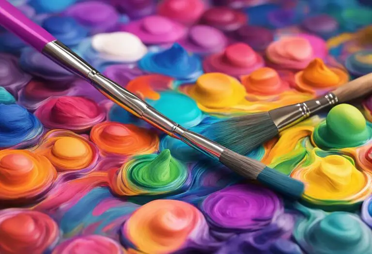
In order to effectively utilize color temperature in artworks, artists can employ various techniques that enhance the visual impact and emotional resonance of their paintings. By understanding how warm and cool colors interact, artists can create harmonious compositions, evoke specific moods, and capture the viewer’s attention. Here are some practical tips to guide artists in harnessing the power of color temperature:
- Mixing and Blending Warm and Cool Colors: Experiment with blending warm and cool colors to create a dynamic interplay of temperature. By strategically placing warm and cool hues next to each other, artists can achieve a sense of depth and dimension in their paintings. This technique also allows for the depiction of different lighting conditions, as warm colors tend to advance while cool colors recede.
- Creating Harmonious Color Schemes: Choose a color scheme that complements the desired mood or theme of the painting. Warm color schemes, featuring predominantly reds, oranges, and yellows, can convey energy, passion, and vitality. Conversely, cool color schemes comprised of blues, greens, and purples can evoke tranquility, serenity, and contemplation. Additionally, incorporating complementary colors, such as pairing warm orange with cool blue, can create a visually striking contrast.
- Utilizing Temperature Contrasts: Experiment with temperature contrasts to add visual interest and focal points to the painting. By juxtaposing warm and cool colors in close proximity, artists can create areas of emphasis and guide the viewer’s gaze. This technique can be particularly effective in directing attention to a specific subject, object, or area within the composition.
Remember, the successful utilization of color temperature requires practice, experimentation, and a keen observation of how colors interact. By mastering these techniques, artists can elevate the emotional impact and overall aesthetic quality of their paintings, creating captivating artworks that resonate with viewers.
| Technique | Description |
|---|---|
| Mixing and Blending Warm and Cool Colors | Experiment with blending warm and cool colors to create depth and dimension in the painting. |
| Creating Harmonious Color Schemes | Select color schemes that convey the desired mood or theme of the painting. |
| Utilizing Temperature Contrasts | Create visual interest and focal points by contrasting warm and cool colors. |
Conclusion
Understanding painting color temperature and the role it plays in art is essential for artists looking to create captivating and impactful artworks. By utilizing warm and cool colors, artists can evoke different emotions, establish mood, and enhance composition.
Warm colors such as red, orange, and yellow bring energy, warmth, and vibrancy to paintings. They can be used to create focal points and convey intense emotions. On the other hand, cool colors like blue, green, and purple evoke calmness, tranquility, and depth. They are perfect for creating a sense of serenity and establishing a visually pleasing balance.
By strategically using warm and cool colors, artists can manipulate color temperature to their advantage. They can convey specific moods, set the tone of a painting, and guide the viewer’s eye across the artwork. Mixing and blending warm and cool colors, creating harmonious color schemes, and using temperature contrasts are all techniques artists can employ to maximize the impact of color temperature in their artworks.
To create captivating and impactful paintings, artists should explore the possibilities offered by painting color temperature. By experimenting and harnessing the power of warm and cool hues, they can bring their artistic vision to life and engage the viewer on an emotional level. Color temperature is a powerful tool that every artist should embrace and master in their artistic journey.